



鎂力新 MAGNESIUM BISGLYCINATE | 包裝設計
「鎂力新」是一款以「打造睡眠好品質」為訴求的甘胺酸螯合鎂保健品(全植物膠囊、全素可食)。
以柔和的暖橘與靜謐色調,將品牌「睡眠、放鬆」的訴求,轉化為一套清晰、專業又好讀的視覺語言。
鎂力新
MAGNESIUM BISGLYCINATE
打造睡眠好品質
For a better night's rest.
品牌識別|Identity
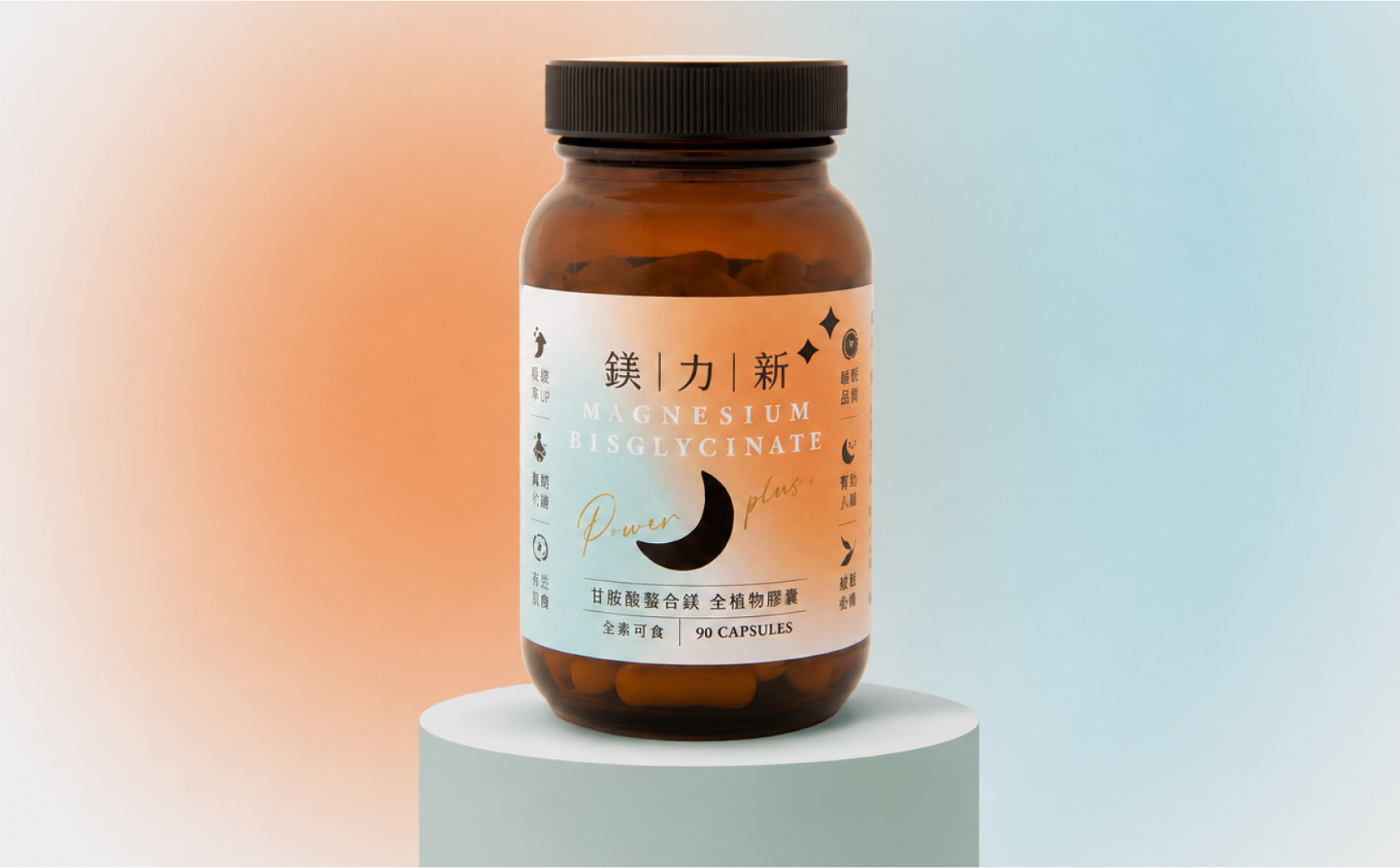
以「鎂|力|新」分隔式標準字為核心,搭配銀灰與暖橘的漸層色調,傳遞專業、溫和而值得信賴的保健品形象。
The identity centres on a segmented wordmark with a silver-and-warm-orange palette — professional, gentle and trustworthy.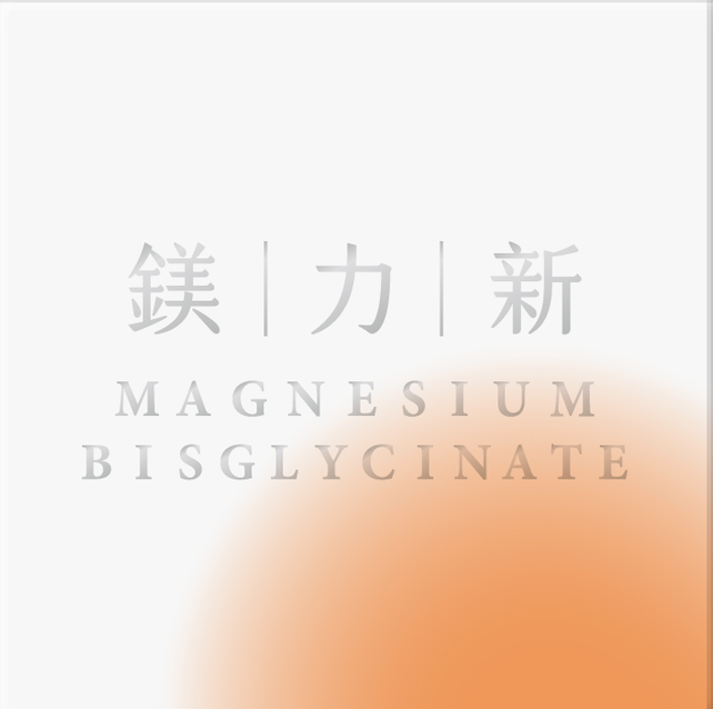
包裝設計 Packaging
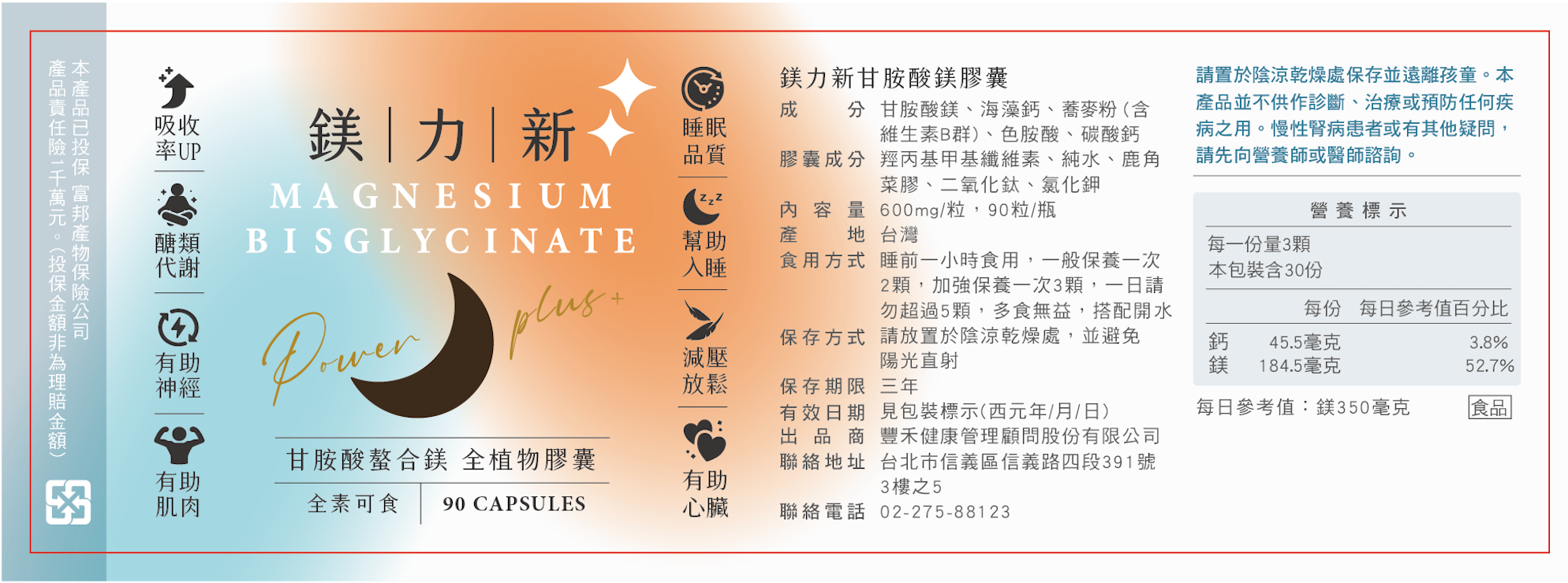
琥珀色瓶身搭配暖橘漸層瓶標,結合月亮意象與機能圖標,將「睡眠、放鬆」的品牌訴求,直觀呈現於包裝之上。
An amber bottle with a warm-gradient label, moon motif and function icons expresses the restful positioning directly on-pack.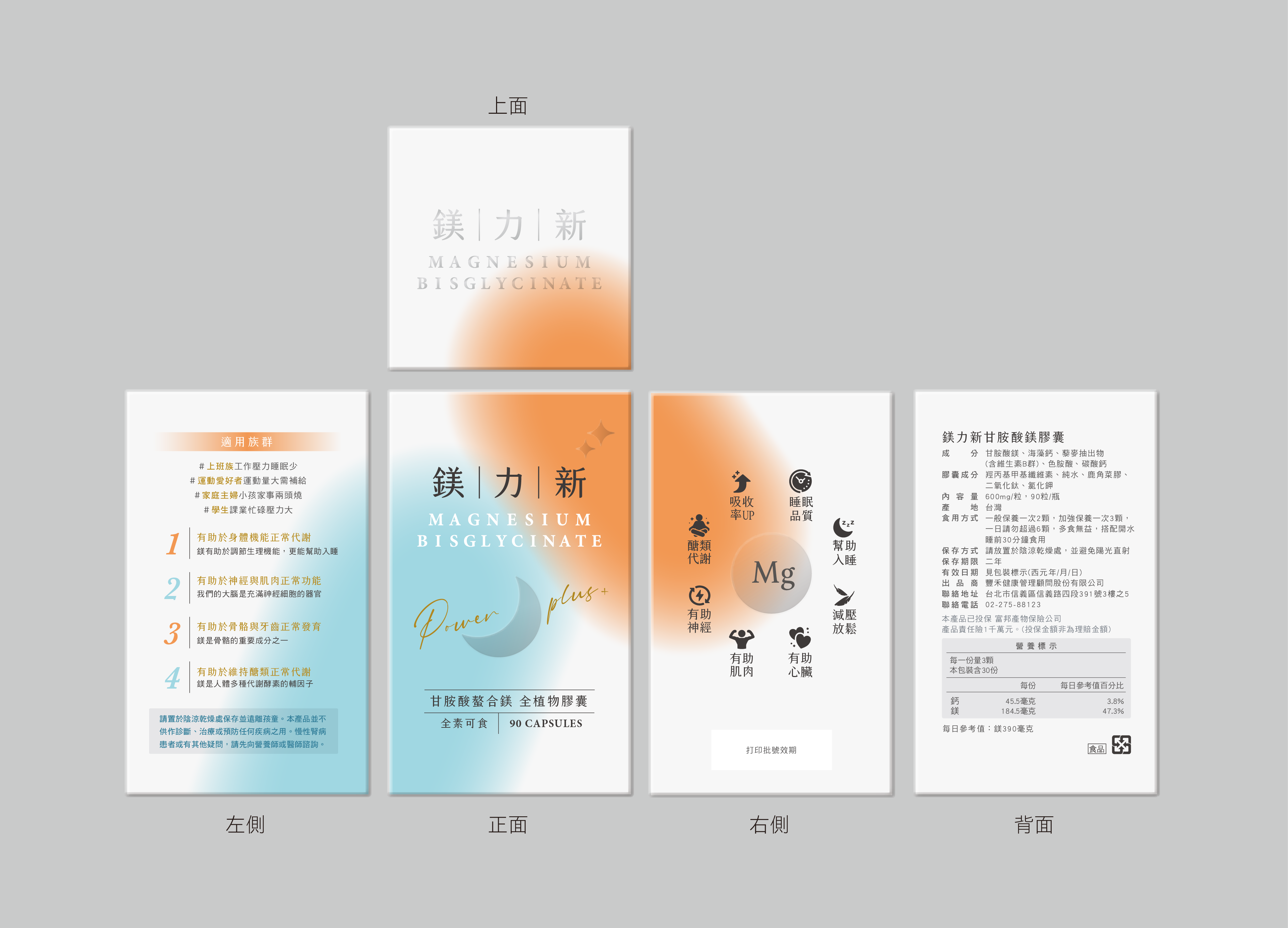
一頁式視覺|Landing Page
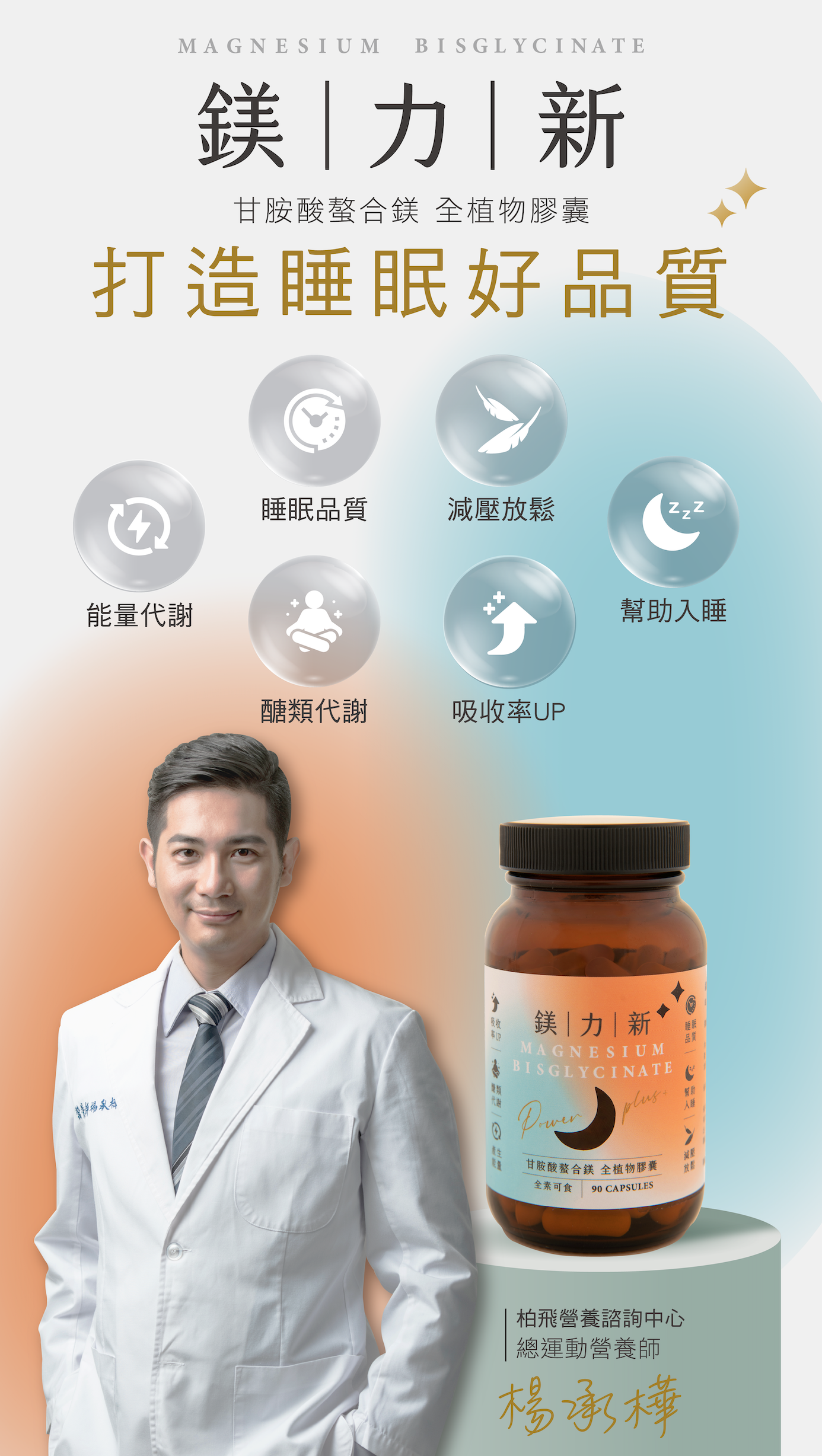
電商一頁式以主視覺標語「打造睡眠好品質」開場,透過六大機能圖標、產品說明與專業營養師背書等區塊,建立清楚的資訊層次與購買信任感。
The e-commerce landing page opens with the key slogan, then organises function icons, product details and a professional endorsement into a clear, trust-building hierarchy.
鎂力新 × 齊禾設計
Mei Li Xin × ChiHe Design
MORE