



OH!HER | 品牌識別設計
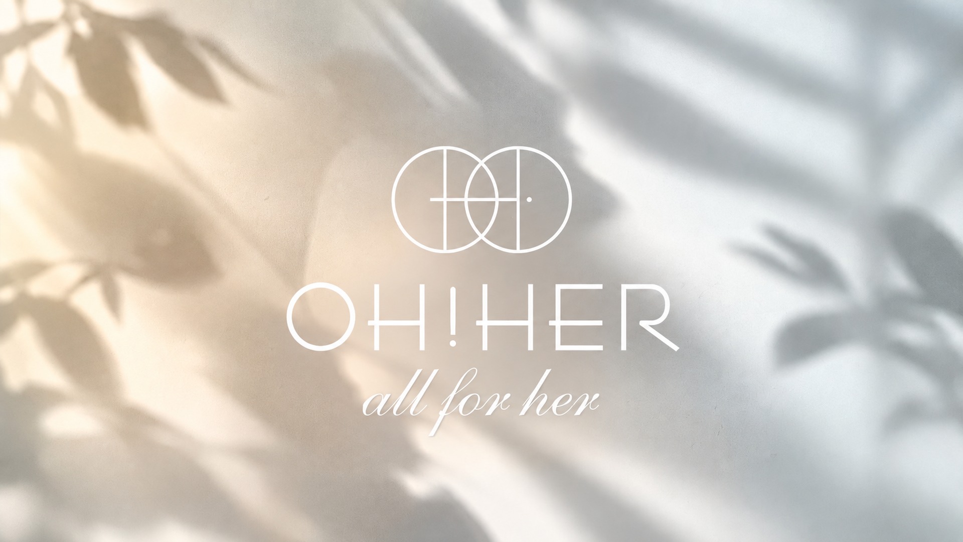
「OH!HER」是一個女性內著品牌。品牌重塑,打造全新的品牌識別系統(CIS),以「all for her」為核心精神。
從標誌、色彩、字體到產品與應用,建立一套柔和、細膩、貼近女性的識別語言,讓每一次貼身的相遇都溫柔而有質感。
OH!HER
all for her
為每一種女性服飾品牌,貼身,也貼心。An intimate-wear brand made for every woman — close to you, and close to heart.
IDENTITY
品牌標誌LOGO
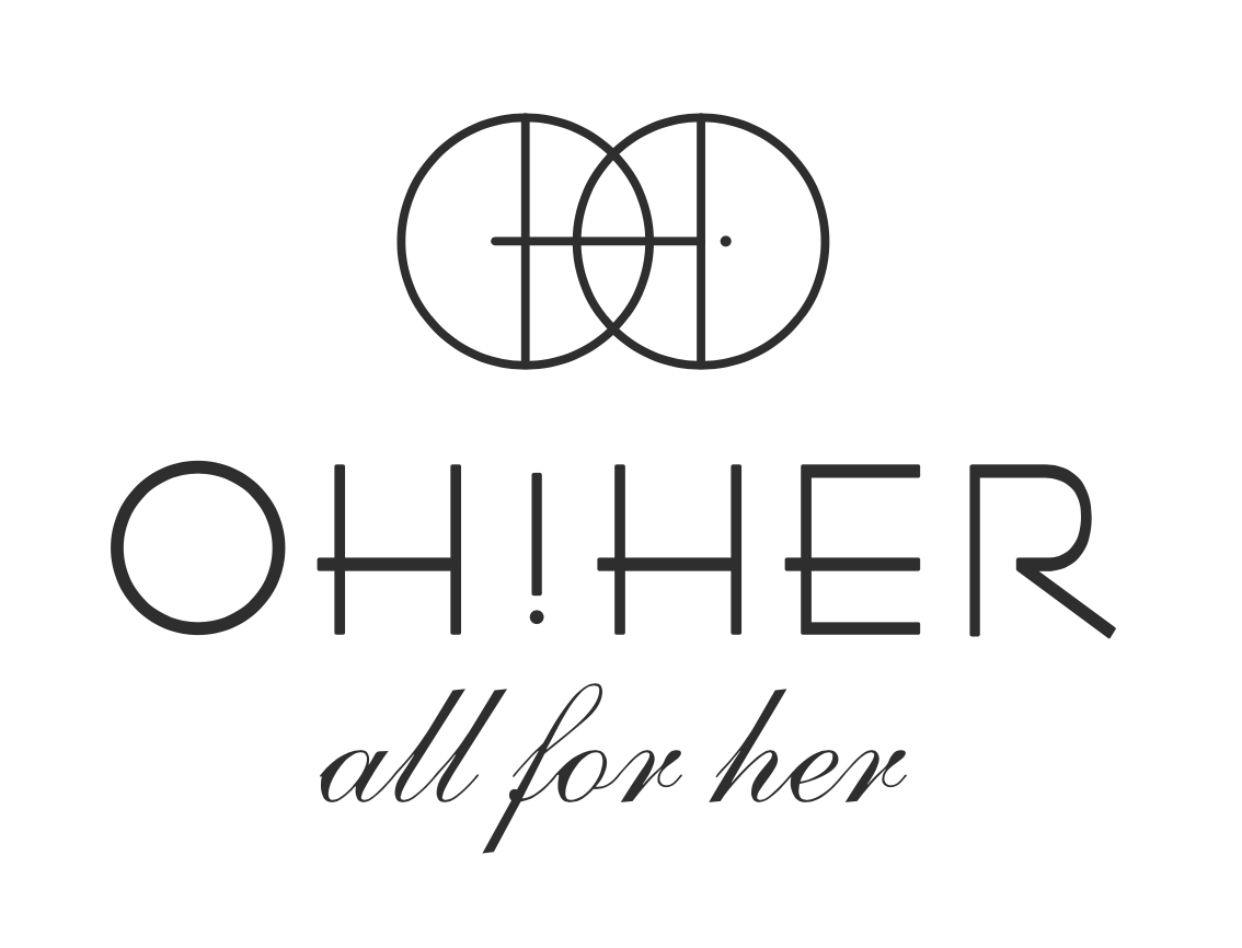
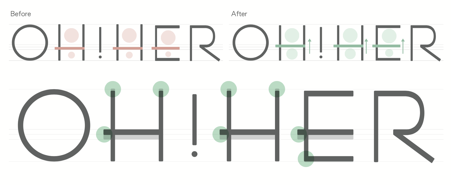
以雙圓交疊構成標誌,象徵女性的柔美與包容;搭配纖細俐落的標準字 OH!HER 與手寫感副標「all for her」,傳遞柔和而自信的品牌個性。Two overlapping circles form the mark — soft, embracing — paired with a delicate wordmark and a handwritten "all for her".
色彩系統COLOUR
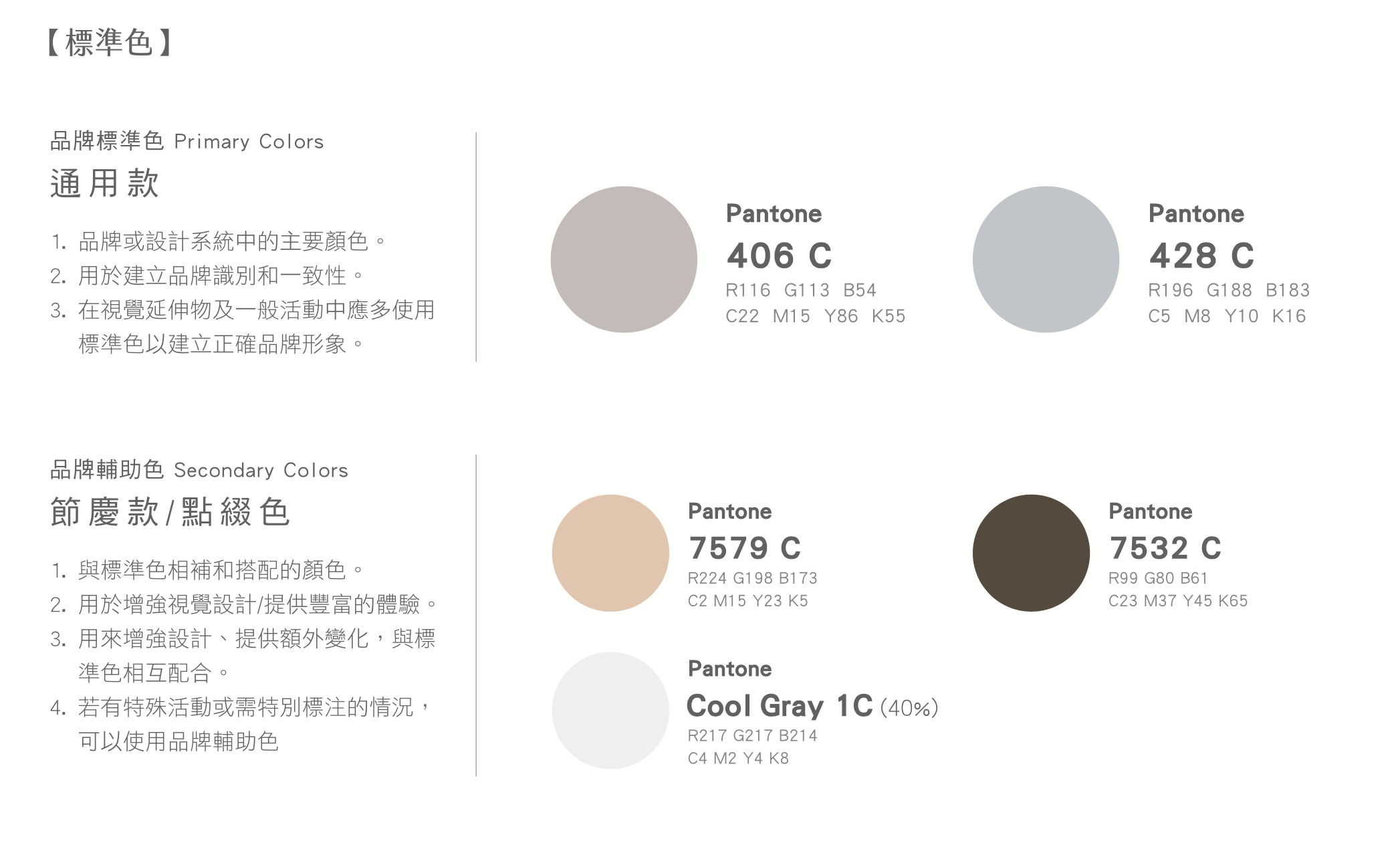
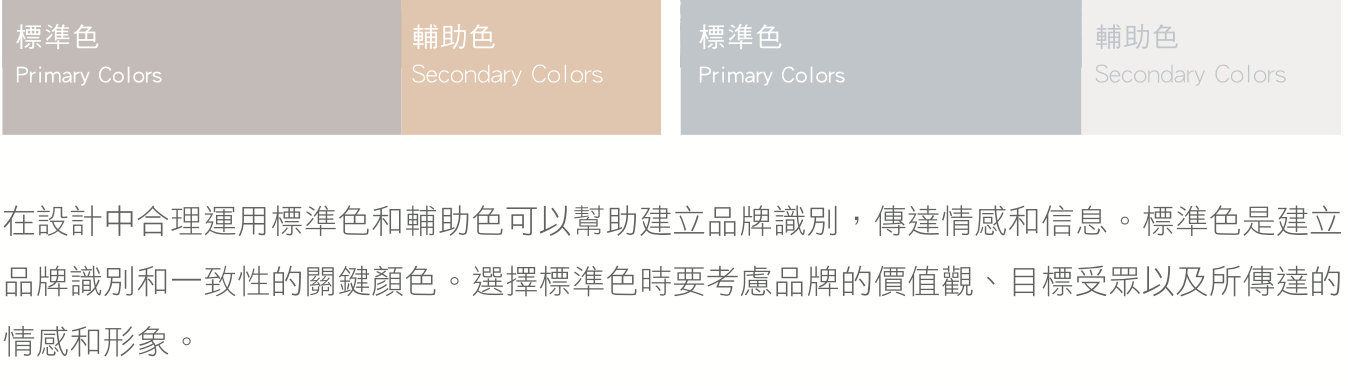
以柔和的裸粉、暖灰與大地色為主,輔以低彩度中性色,呼應內著貼近肌膚的溫度與質感,建立柔美、耐看的品牌色彩印象。
Nude, warm grey and earthy tones echo the skin-close warmth of intimate wear.
Nude, warm grey and earthy tones echo the skin-close warmth of intimate wear.
字體 · 標語ALL FOR HER
手寫感的「all for her」貫穿品牌,柔軟的筆觸呼應女性的細膩,成為 OH!HER 最具識別度的情感語彙。
The handwritten "all for her" runs through the brand as its most recognisable, emotive signature.
The handwritten "all for her" runs through the brand as its most recognisable, emotive signature.
產品與應用PRODUCT & APPLICATION
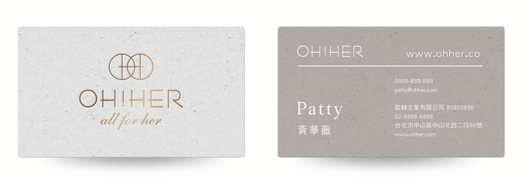
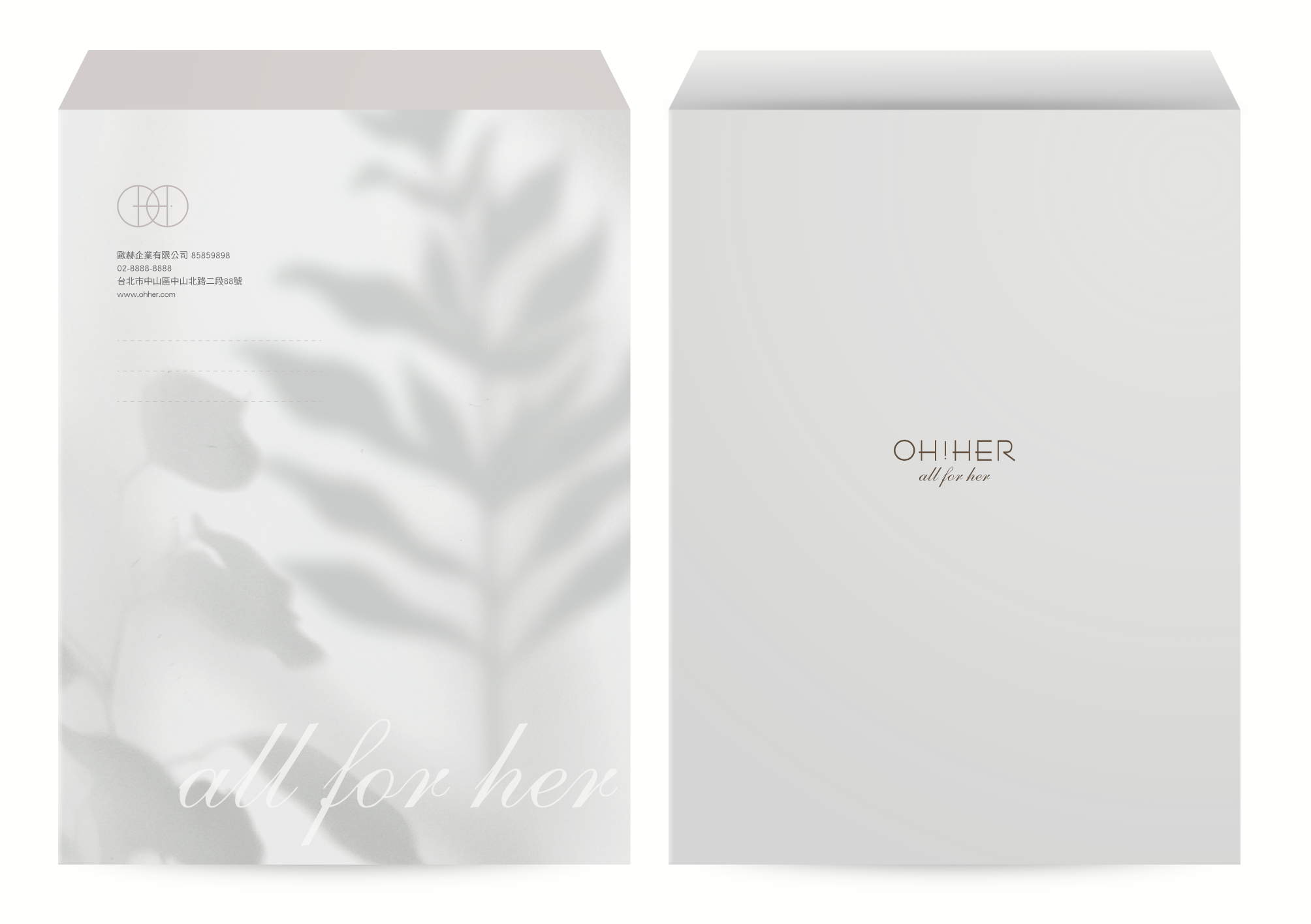
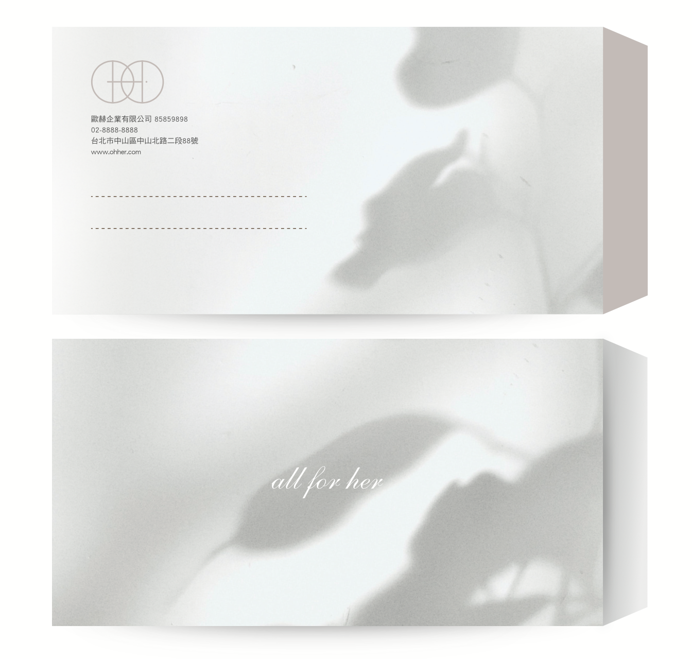
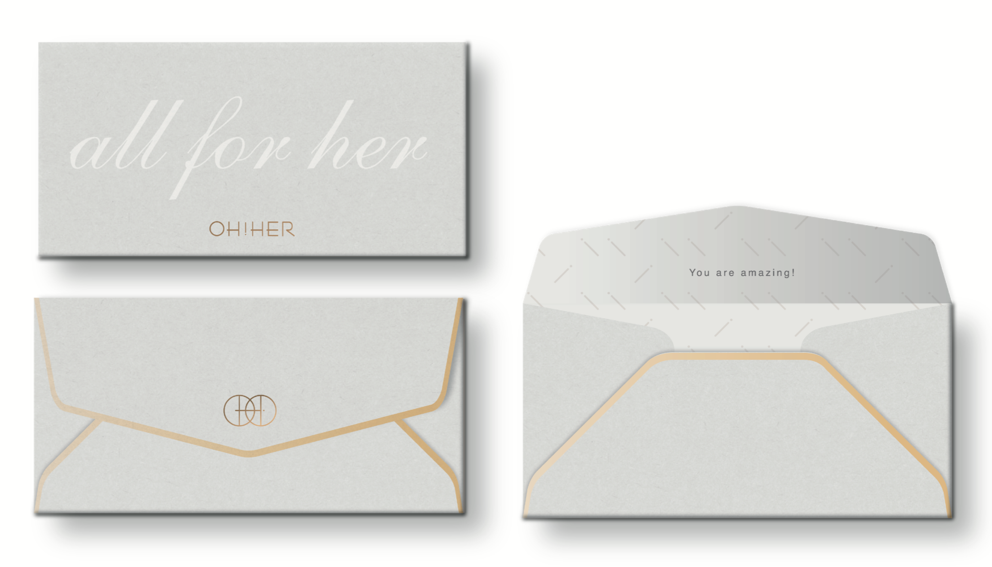
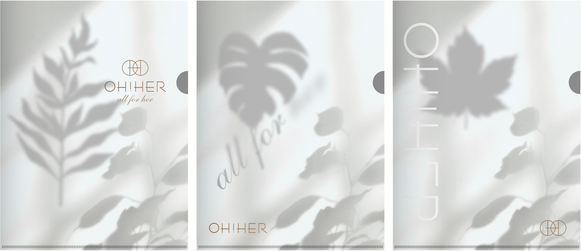
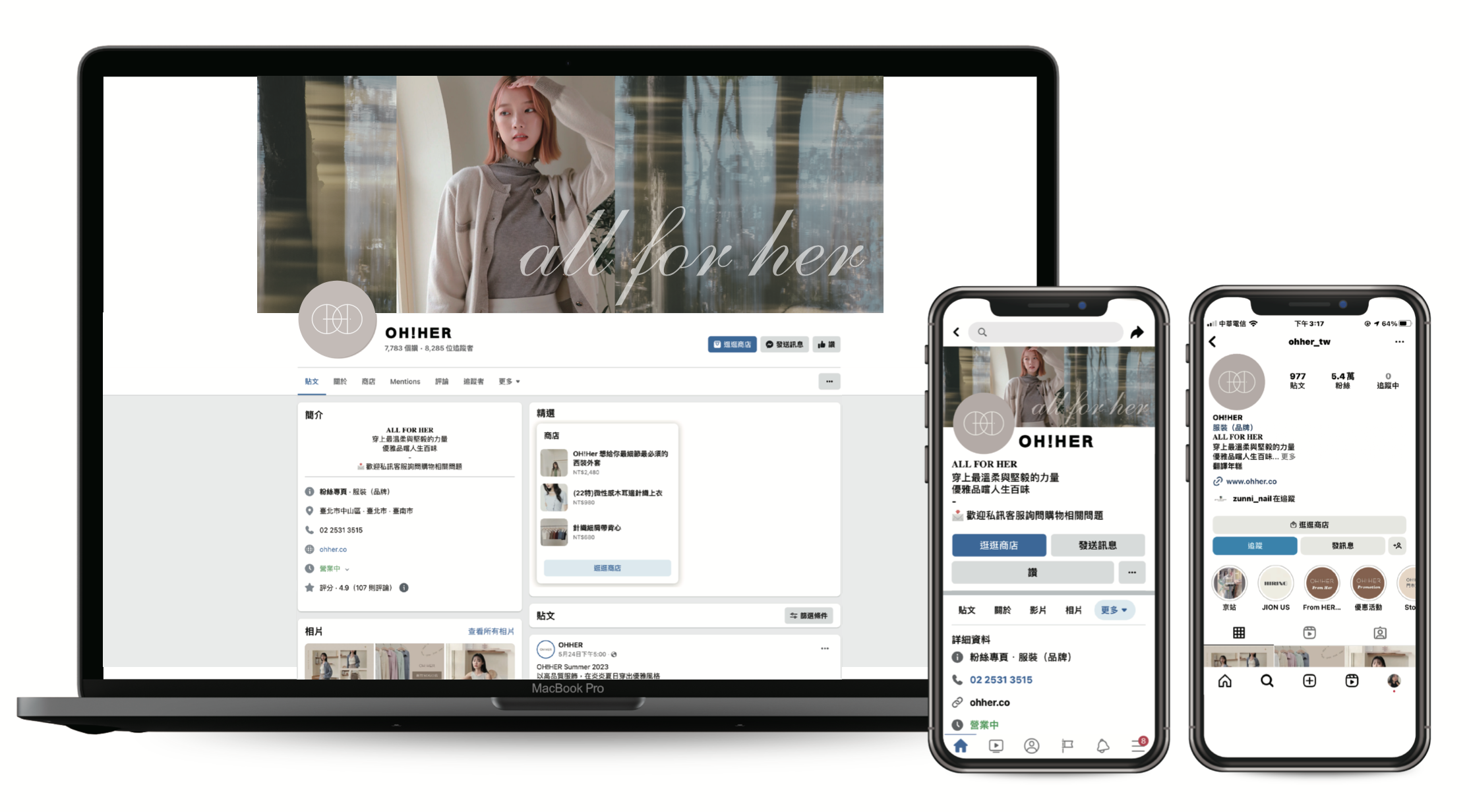
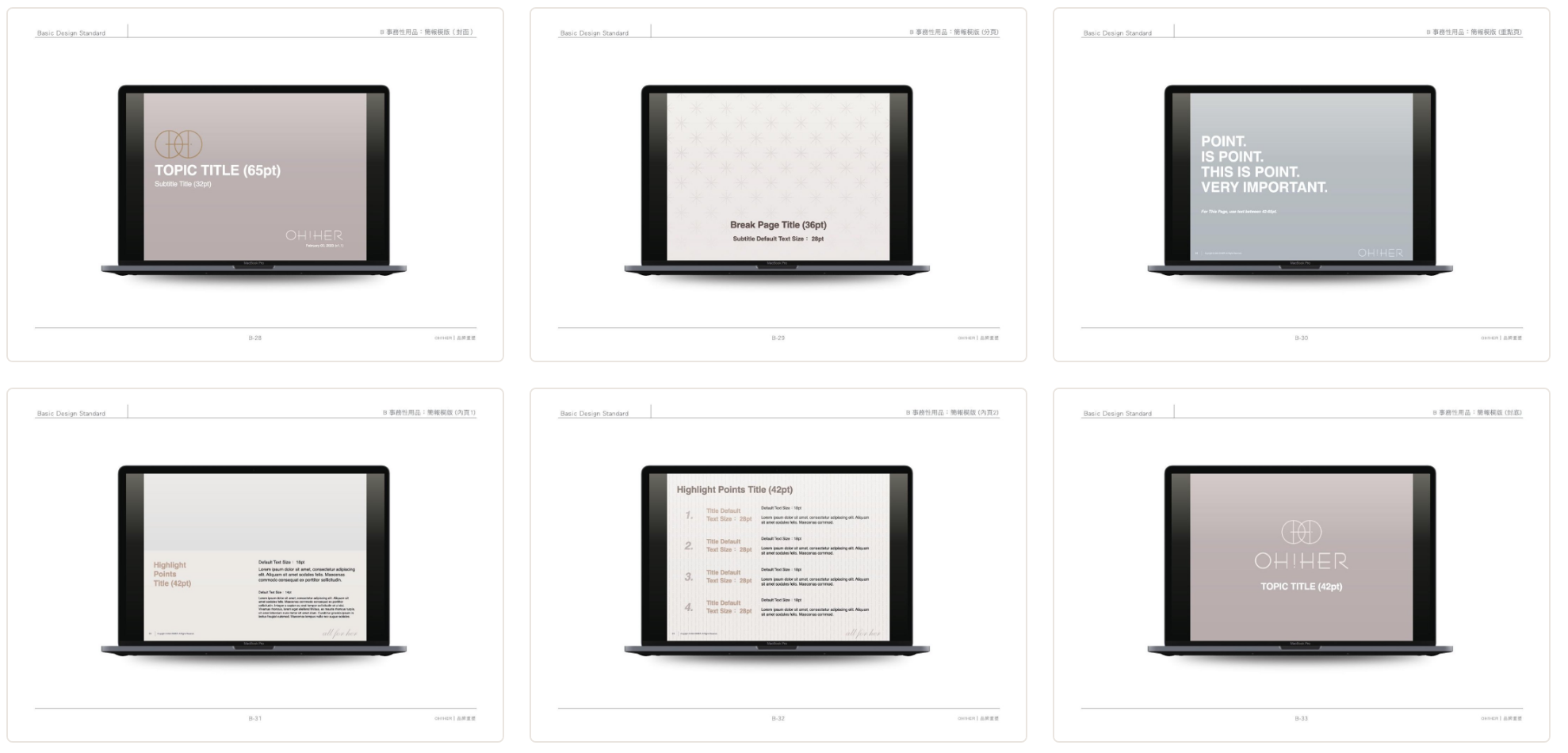
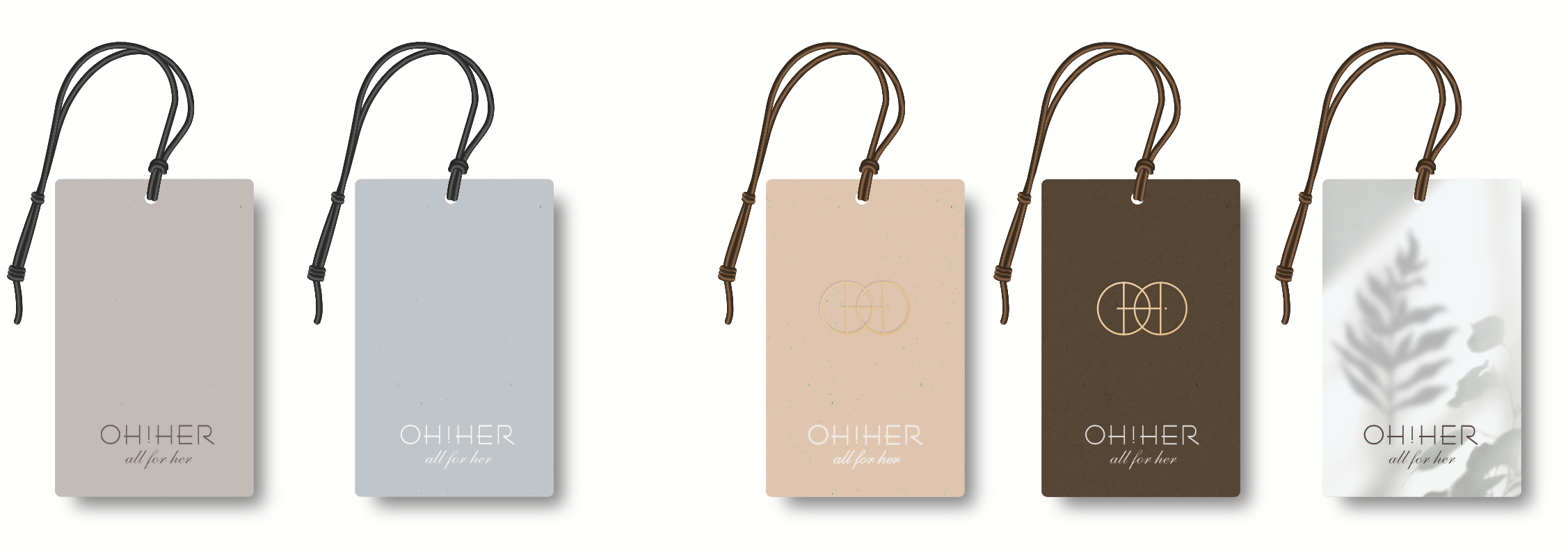
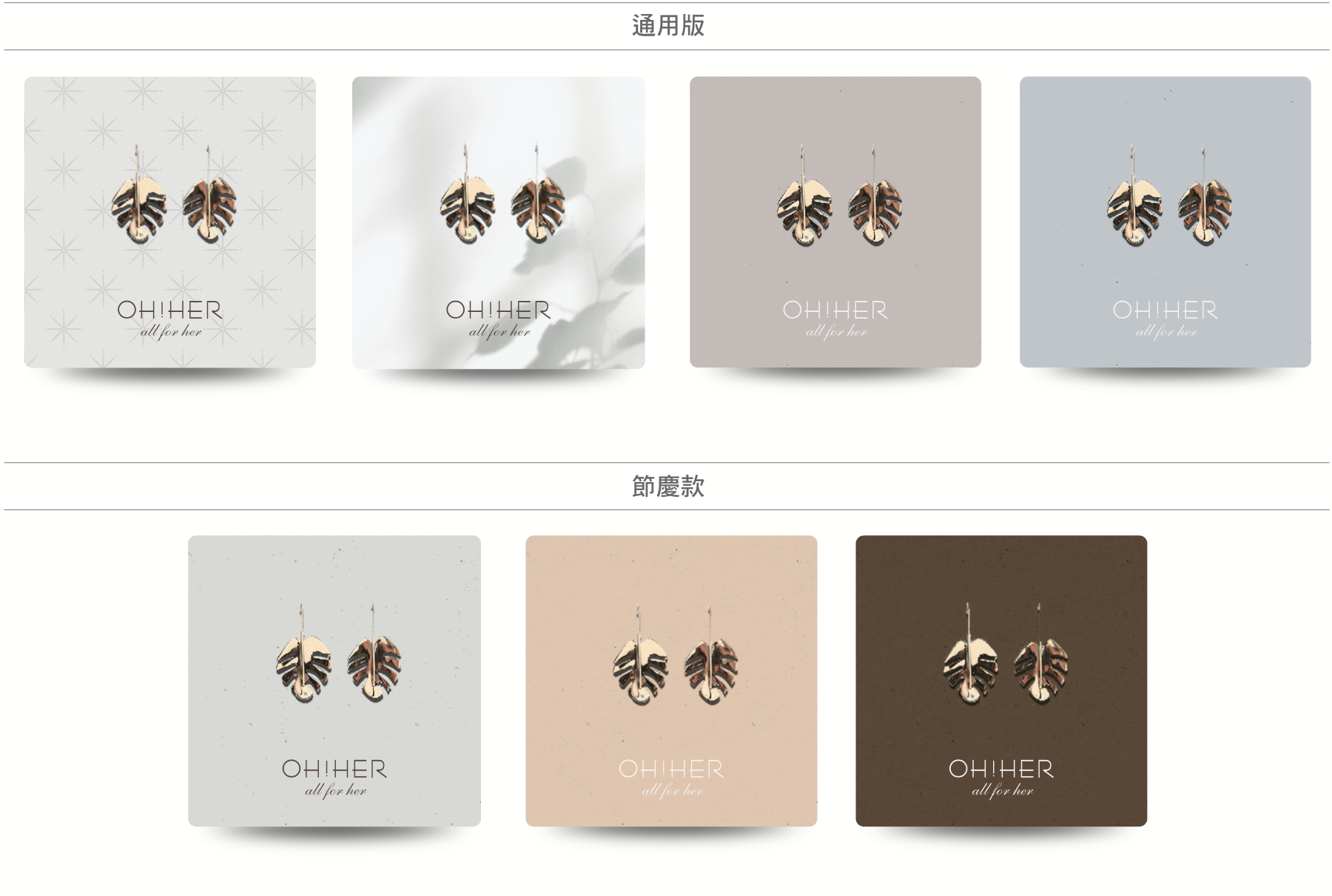
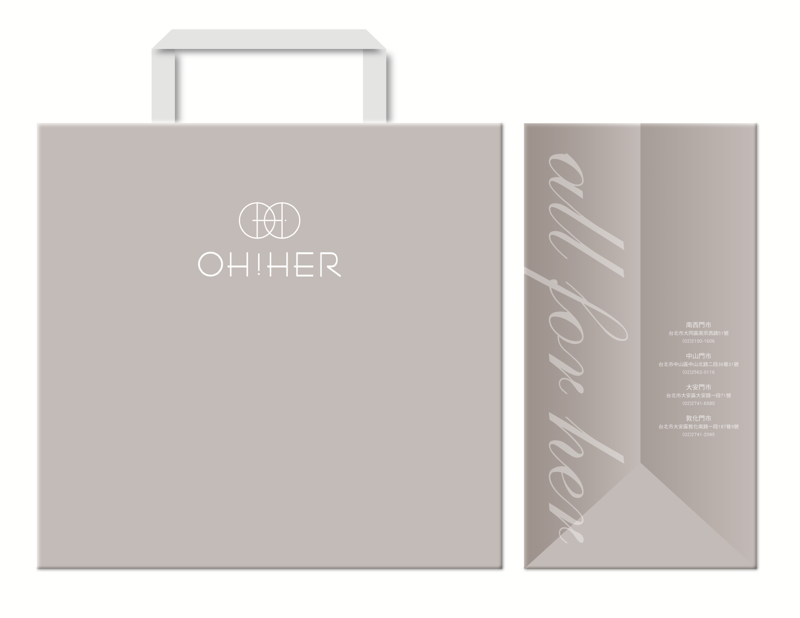
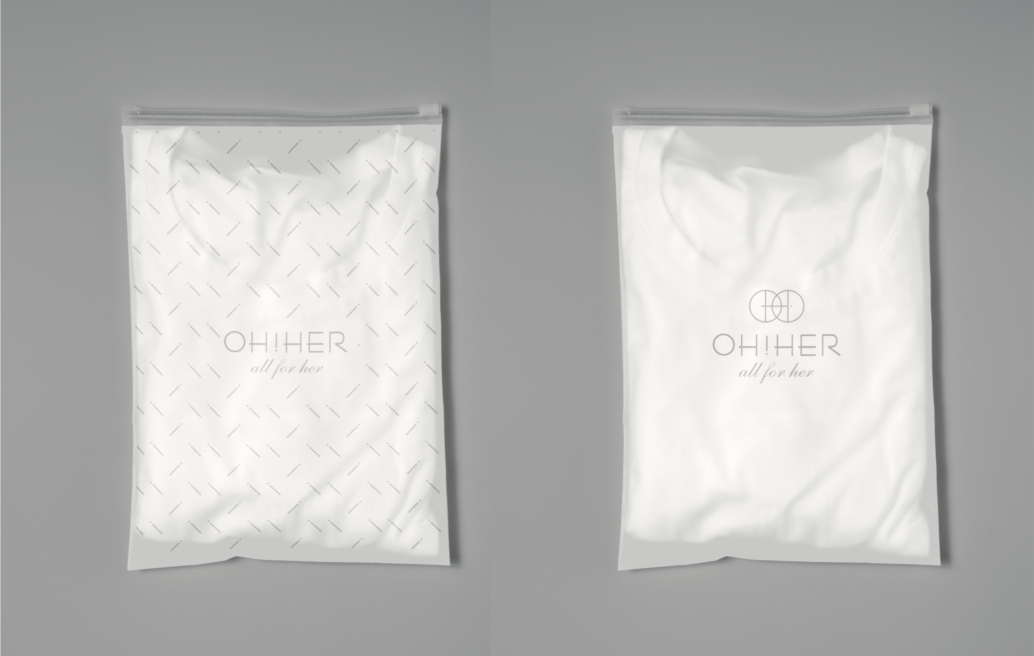
品牌識別延伸至產品包裝與應用系統——包裝、吊牌、提袋等,將「all for her」的柔和質感,落實到每一個與消費者相遇的細節。
The identity extends into packaging and applications, carrying the brand's softness into every touchpoint.
The identity extends into packaging and applications, carrying the brand's softness into every touchpoint.
OH!HER
all for her
OH!HER × 齊禾設計
OH!HER × ChiHe Design
OH!HER × ChiHe Design
MORE