ASK心動力 | 識別系統
心動力是提供蛻變生面的內功心法的道場,讓熱愛生面的人共修互練,以至於世界也隨而變得更美好。
心動力提供最有效的蛻變式課程,協助人們自我探索及重新建構生命。一般心靈成長課程以體驗式課程帶領學員,而ASK最大的不同是以「人」為出發點,並相信「蛻變」後生命才會有下一步。
心動力是提供蛻變生面的內功心法的道場,
讓熱愛生面的人共修互練,
以至於世界也隨而變得更美好。
「ASK心動力|品牌設計」
心動力提供最有效的蛻變式課程,協助人們自我探索及重新建構生命。
一般心靈成長課程以體驗式課程帶領學員,而ASK最大的不同是以「人」為出發點,並相信「蛻變」後生命才會有下一步。
ASK Vision provides the most effective ways to help people explore and rebuild their lives.
Compare to other self-growth courses, ASK Vision's biggest difference is that they focus on "people" as the central point, and they believe that "transformation" has to happen before life itself finds its course.
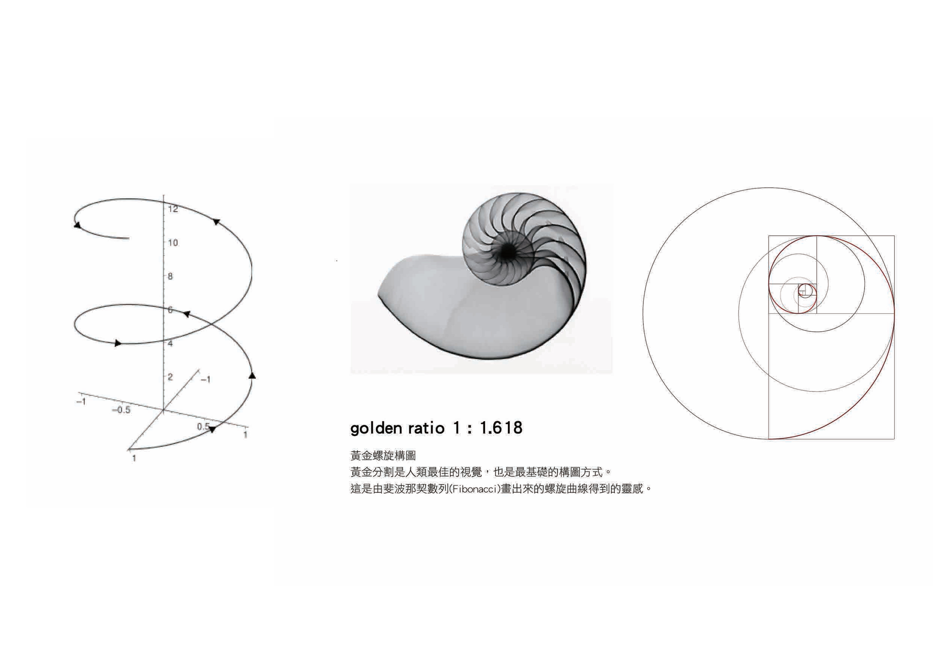
黃金比例
黃金比例又稱黃金分割,在構圖上具有嚴格的比例性、藝術性、和諧性,蘊藏著豐富的美學價值,並與整個社會、自然、宇宙密不可分;人的耳朵、蜘蛛網、向日葵的種子、星辰間的排列等,是世界上的準則與定律。
The golden ratio is also called the golden cut of proportion; where strict rules on the artistic level and the harmony are applied. It is inseparable with the society, the mother nature and the universe. For example, the human ears, the spider web, the sunflower seeds and the arrangement of stars etc… All of the compositions follow the universe's principles and norms.
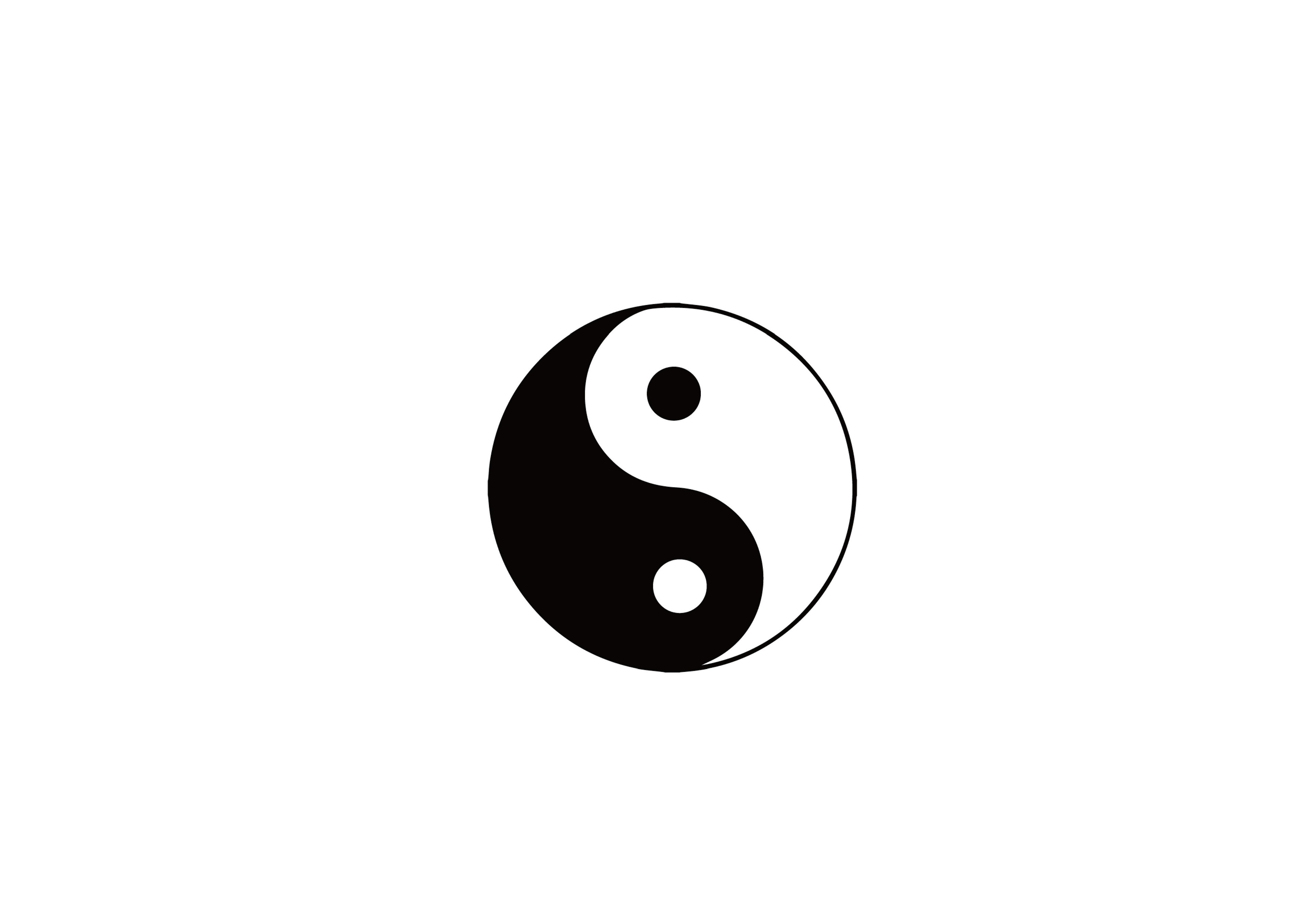
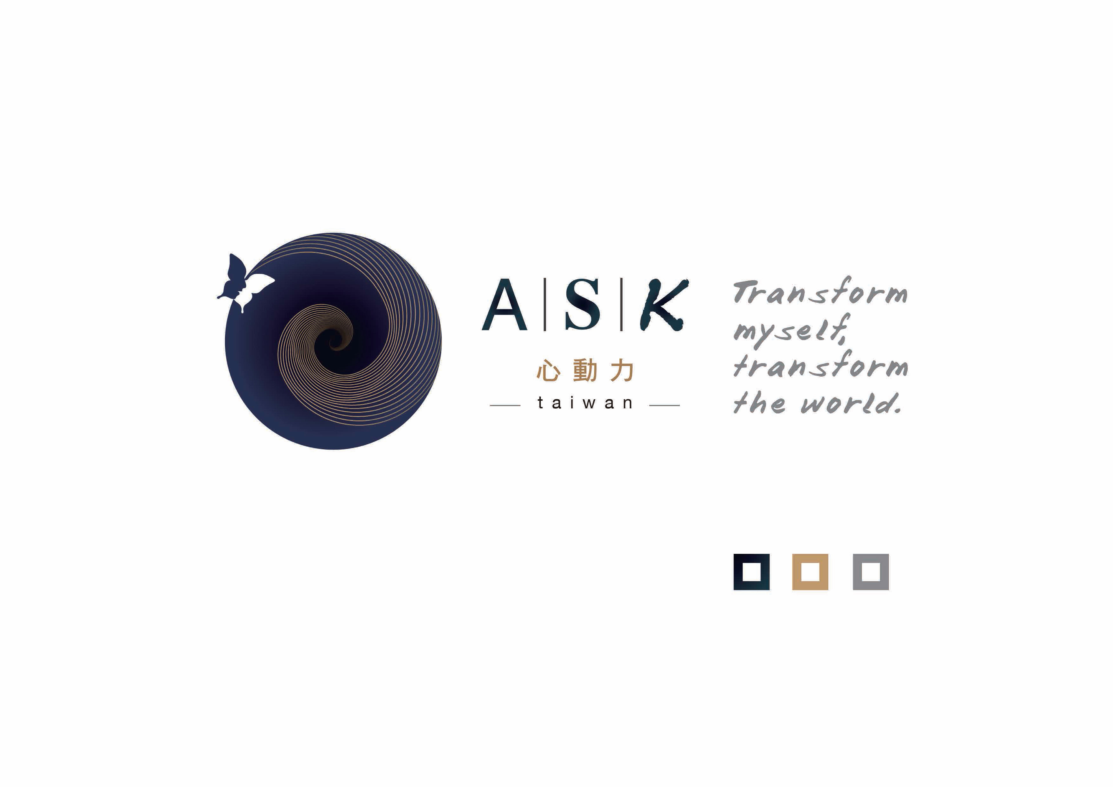
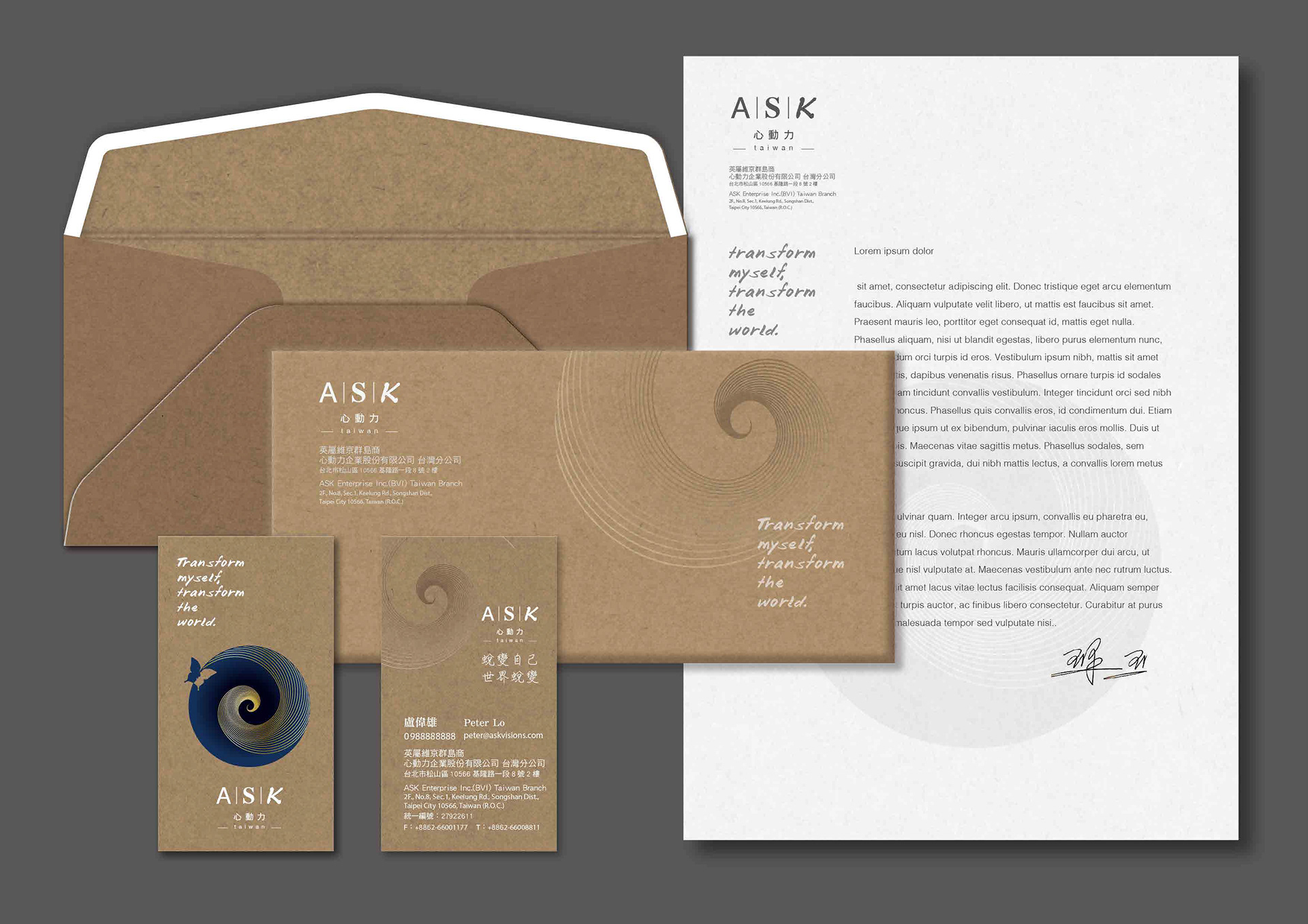
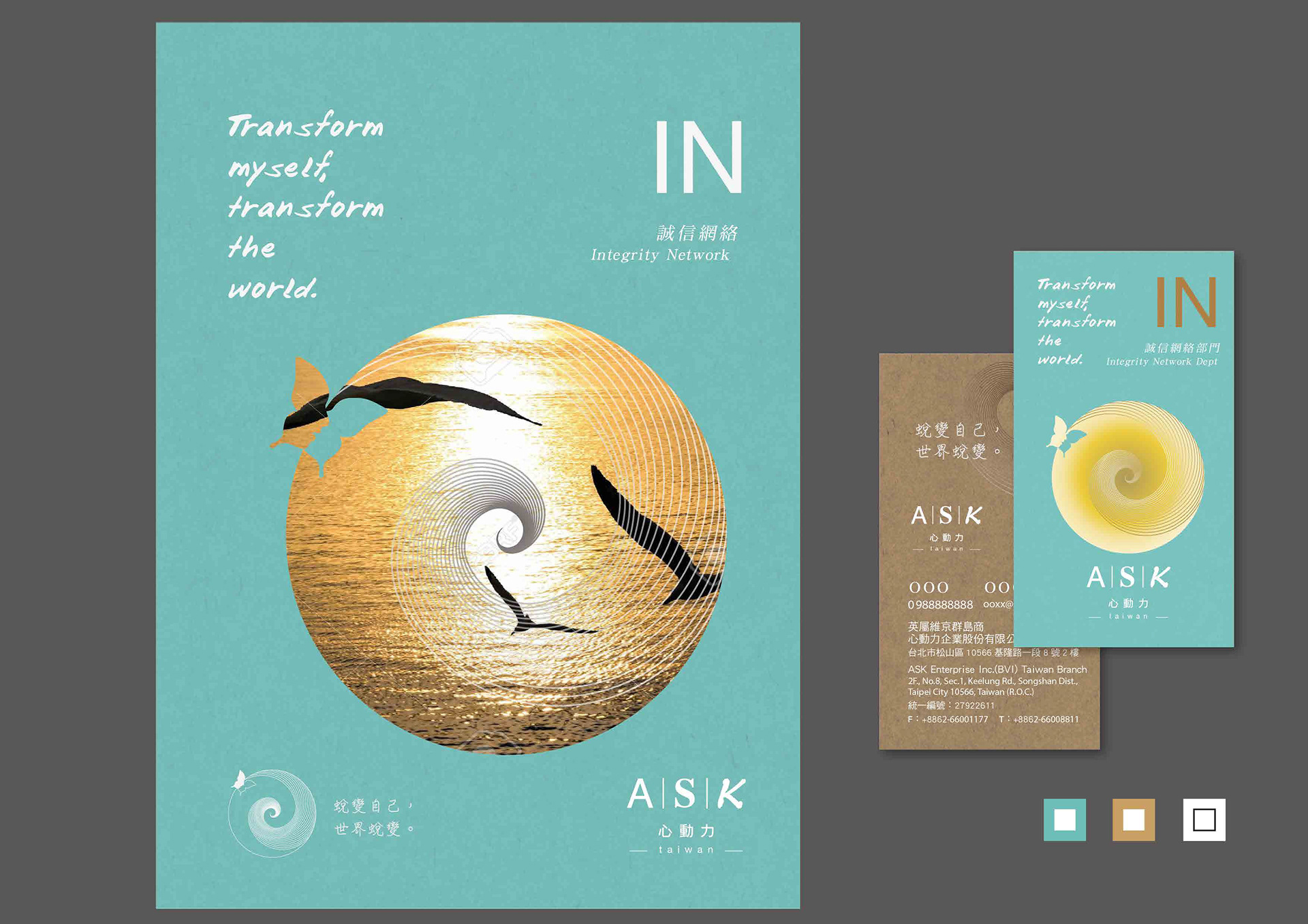
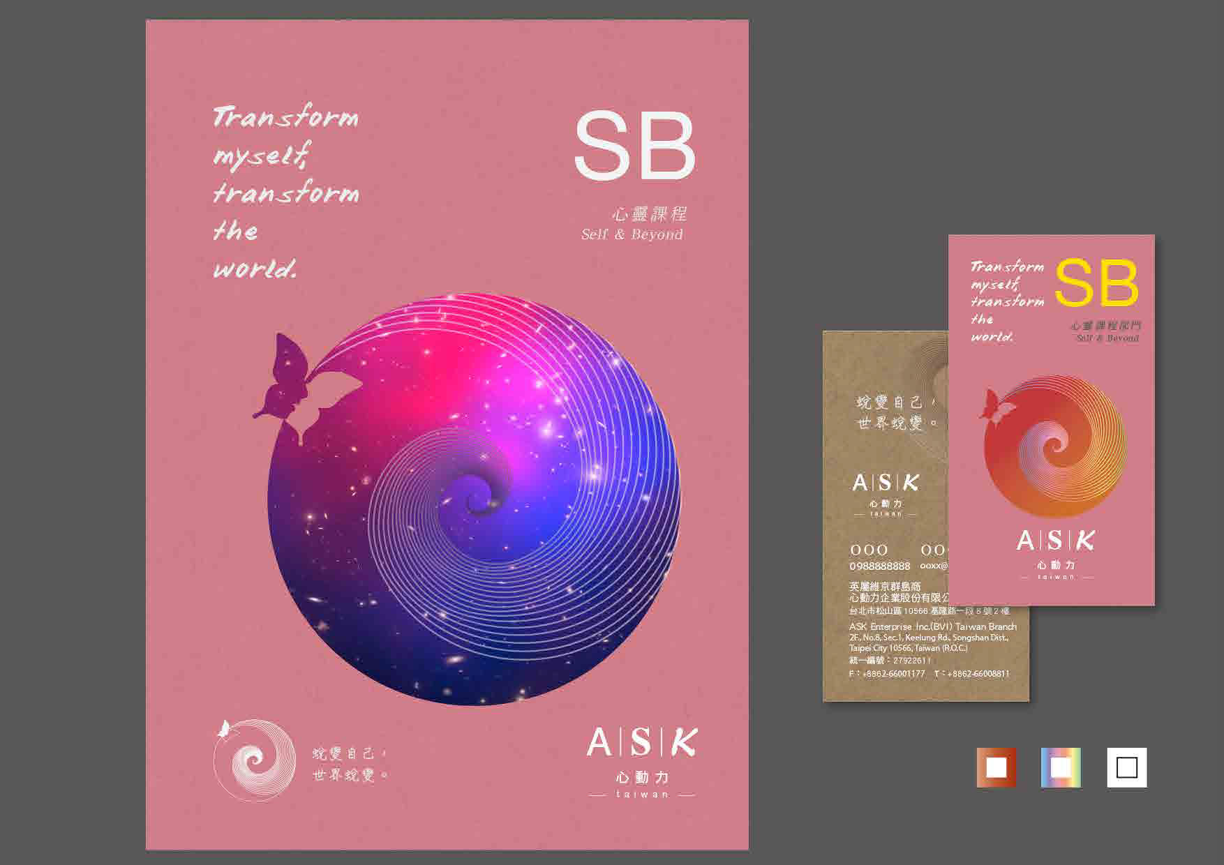
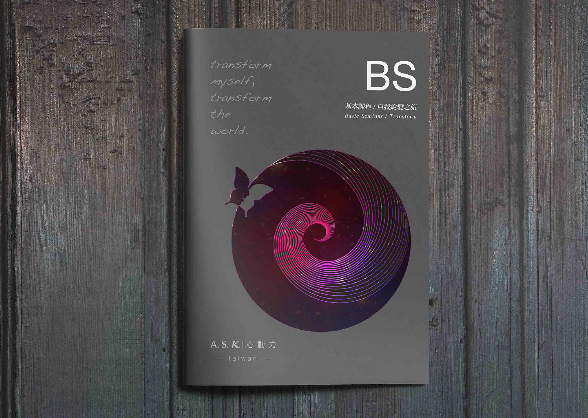
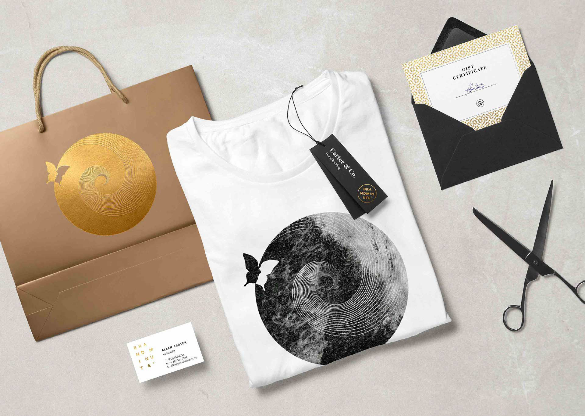
我們相信人跟宇宙之間,能量是流動的。透過向上延伸的黃金比例螺旋,帶領人們往心深處探索、蛻變,同時也結合太極陰陽的意象,來傳遞萬物之間的平衡。
We believe that energy is constantly flowing between all humans and the universe. The gold spiral serves as a symbol to lead people to explore and transform the depths of their mind and heart. And in combination of the Tai Chi image, the Yin / Yang force, to emphasize on the importance of balance between all matters.
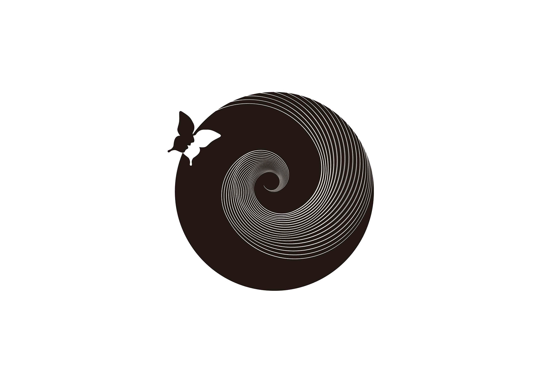
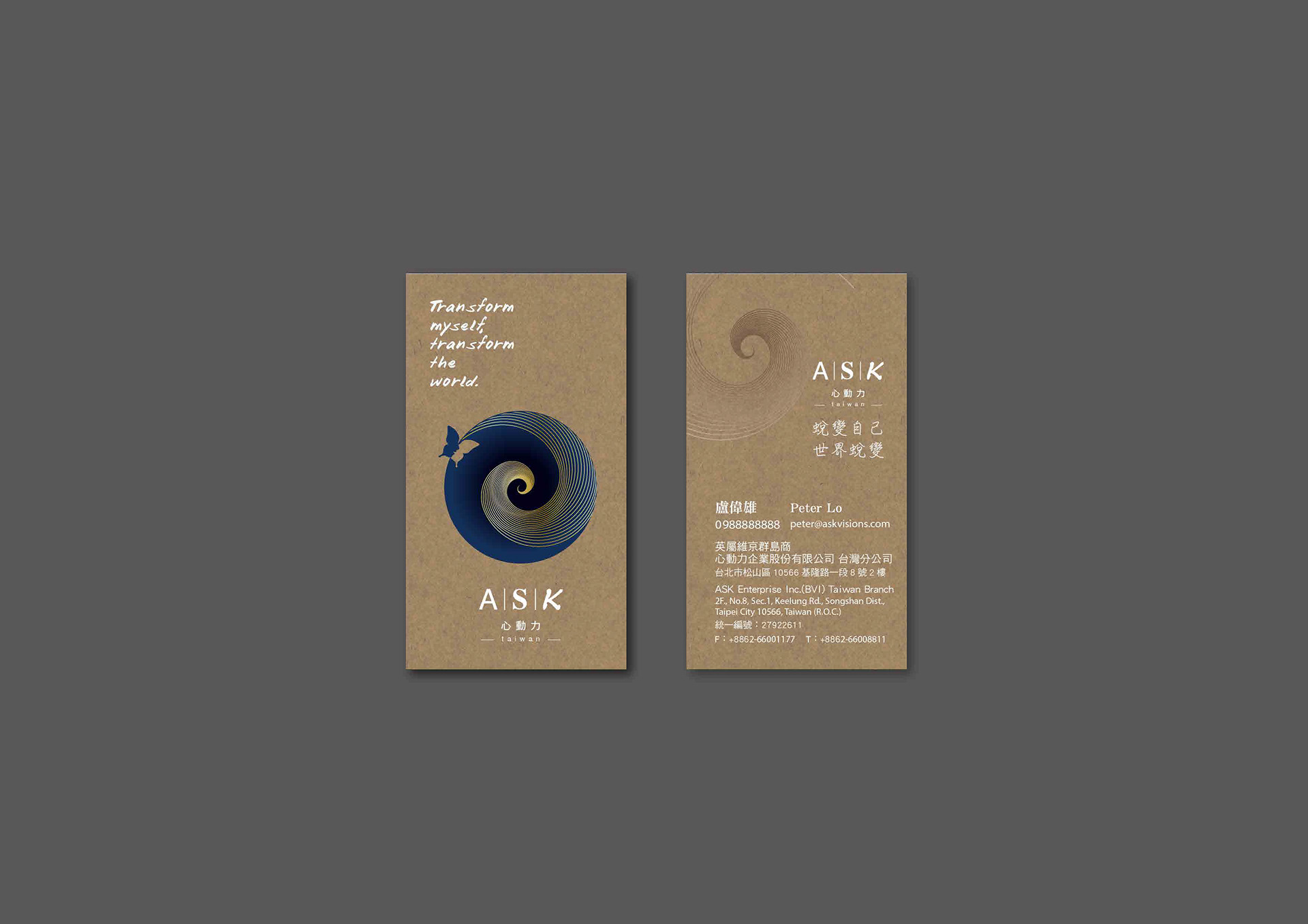
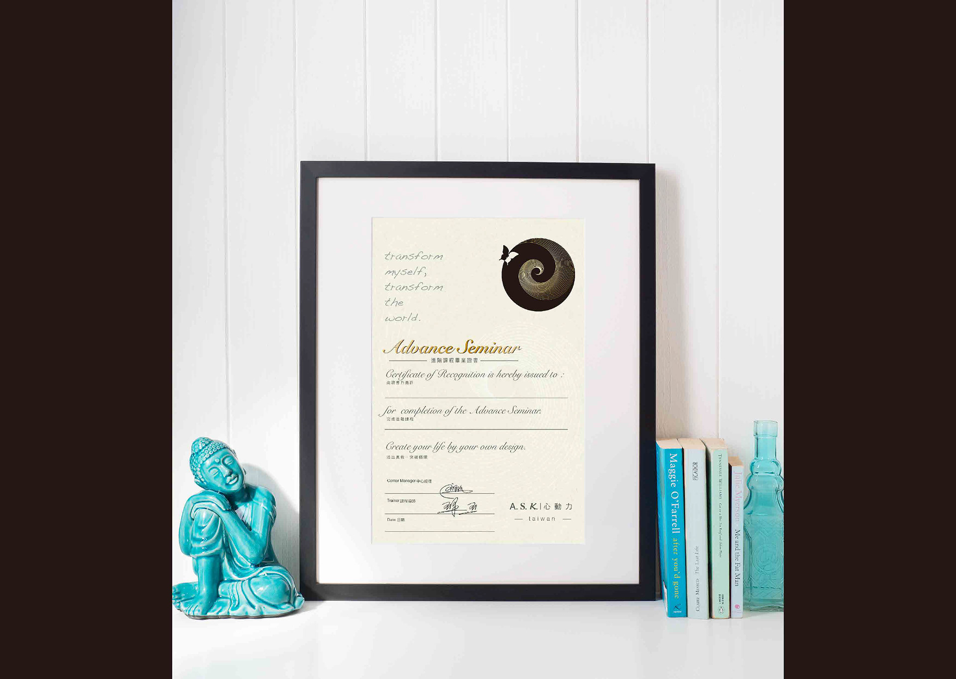
在螺旋的動線上有一隻由兩個側臉組成的展翅蝴蝶,代表著你,透過自己的帶領,往內心深處探索飛翔,你順著螺旋旋轉飛舞,再次回到原點時,你還是你,但你已經不再是原來的那個你。
There is also a butterfly that is composed of two side face; symbolizing an individual flying deeply into one's mind through the leading spiral and back to the starting point. And after the journey, the individual is still the same person but with a totally different mind set.
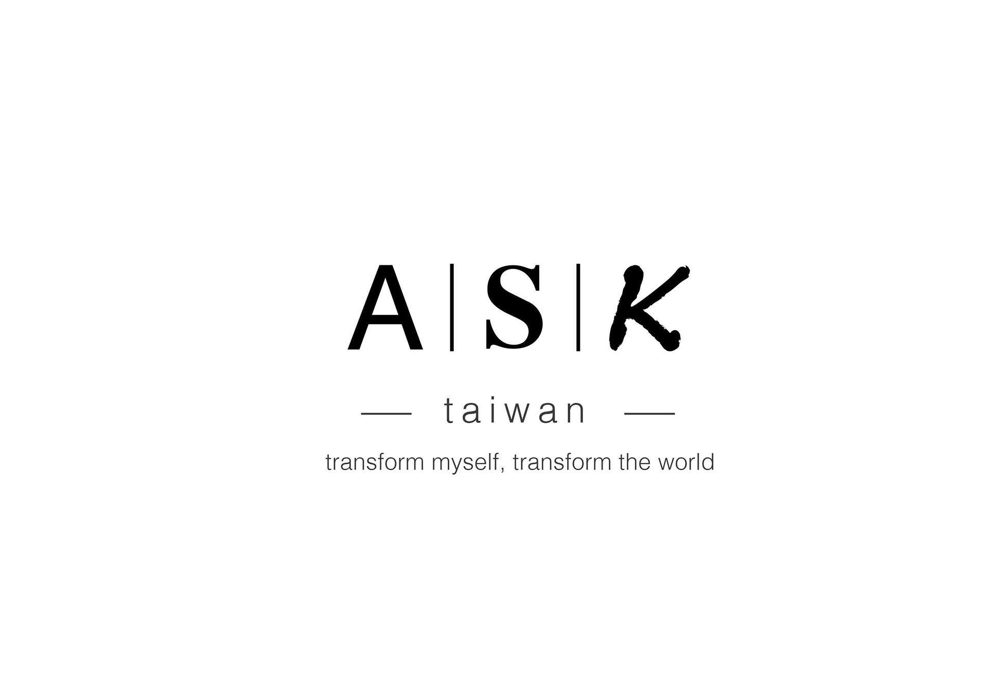
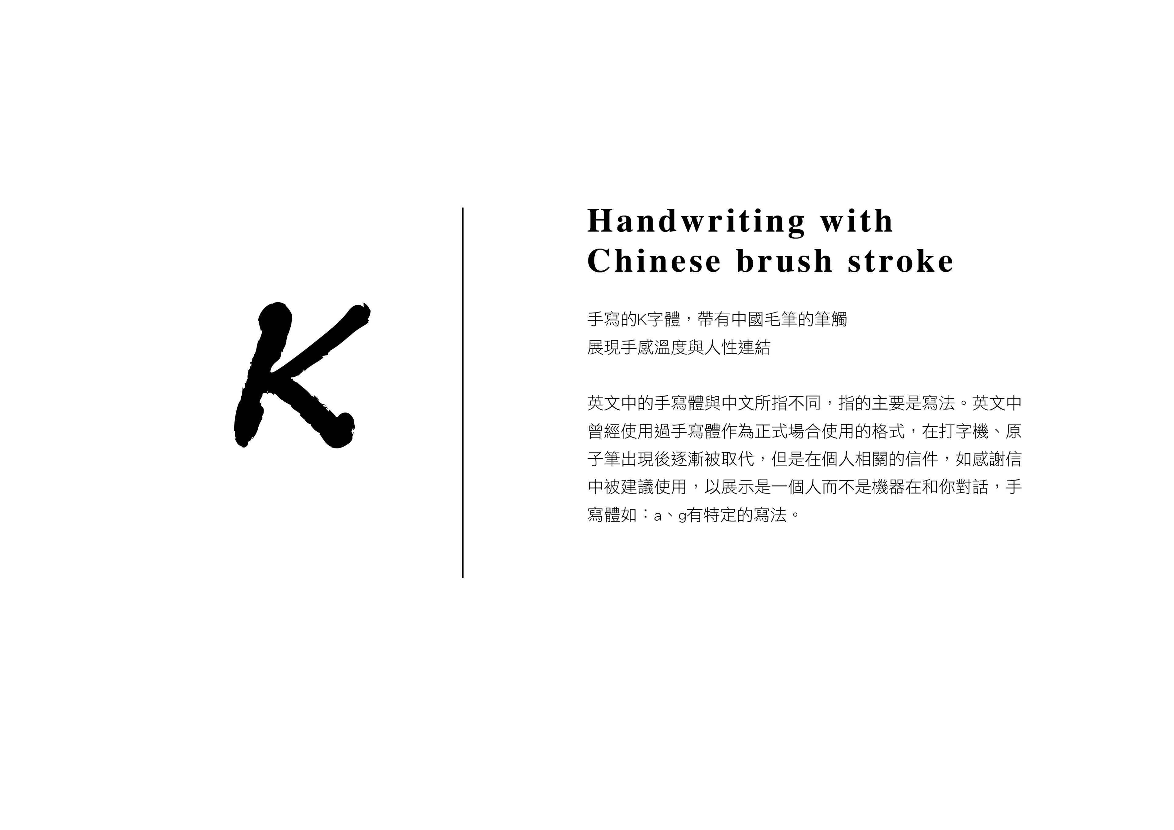
現今世界上,字體皆是以明體、黑體、書寫體構成;我們將標題ASK三個字分別使用這三種字體,代表包容所有的衝突與不平衡,在這之中我們是平衡平等的。
In today's world, all fonts are composed of bold, curved, and written. We combined these three fonts to make the title for ASK Vision as to incorporate all the conflicts and inequality; that within in all, we are all equal.
Helvetica
Helvetica or Neue Haas Grotesk is a widely used sans-serif typeface developed in 1957 by Swiss typeface designer Max Miedinger with input from Eduard Hoffmann. Helvetica is a neo-grotesque design, one influenced by the famous 19th century (1890s) typeface Akzidenz-Grotesk and other German and Swiss designs.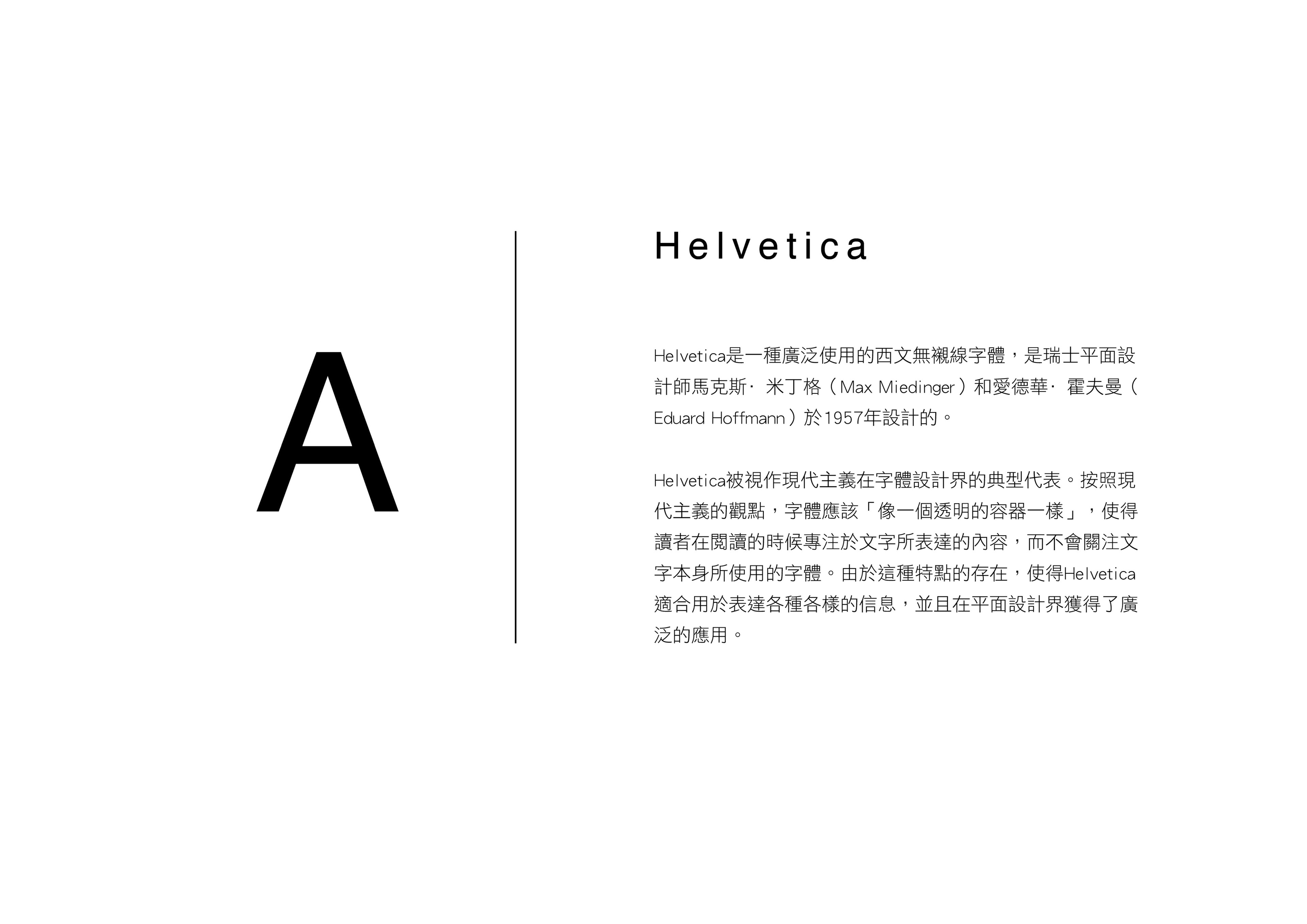
Times New Roman
Times New Roman is a serif typeface. It was commissioned by the British newspaper The Times in 1931 and conceived by Stanley Morison, the artistic adviser to the British branch of the printing equipment company Monotype, in collaboration with Victor Lardent, a lettering artist in The Times's advertising department.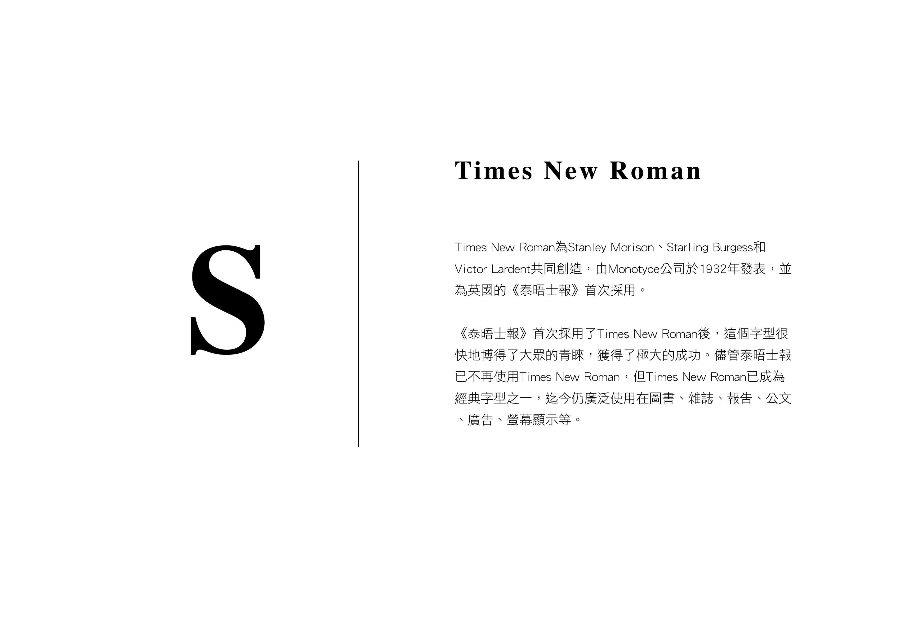
Handwriting
Handwriting is the writing done with a writing instrument, such as a pen or pencil, in the hand. Handwriting includes both printing and cursive styles and is separate from formal calligraphy or typeface. Because each person's handwriting is unique and different, it can be used to verify a document's writer.
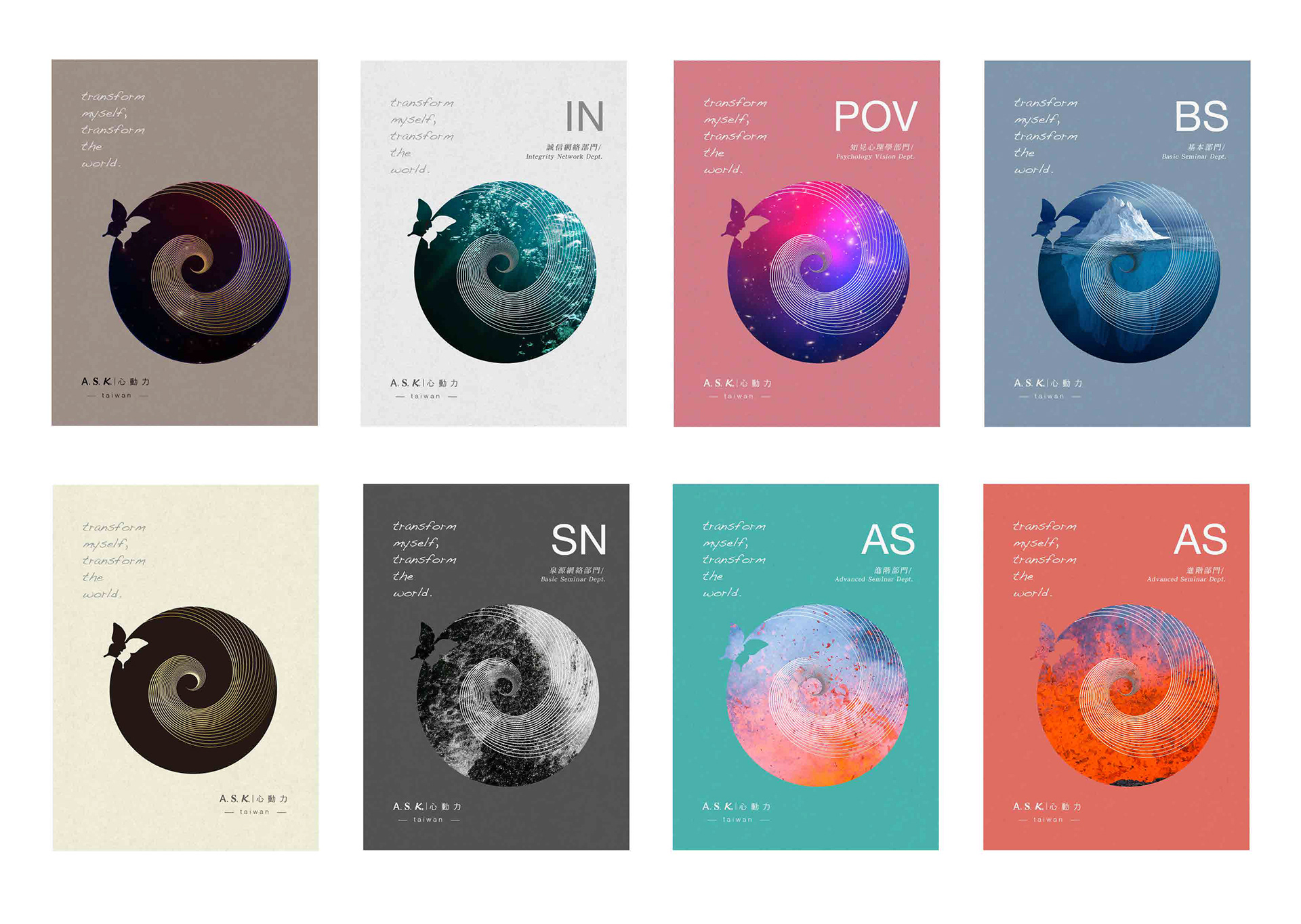
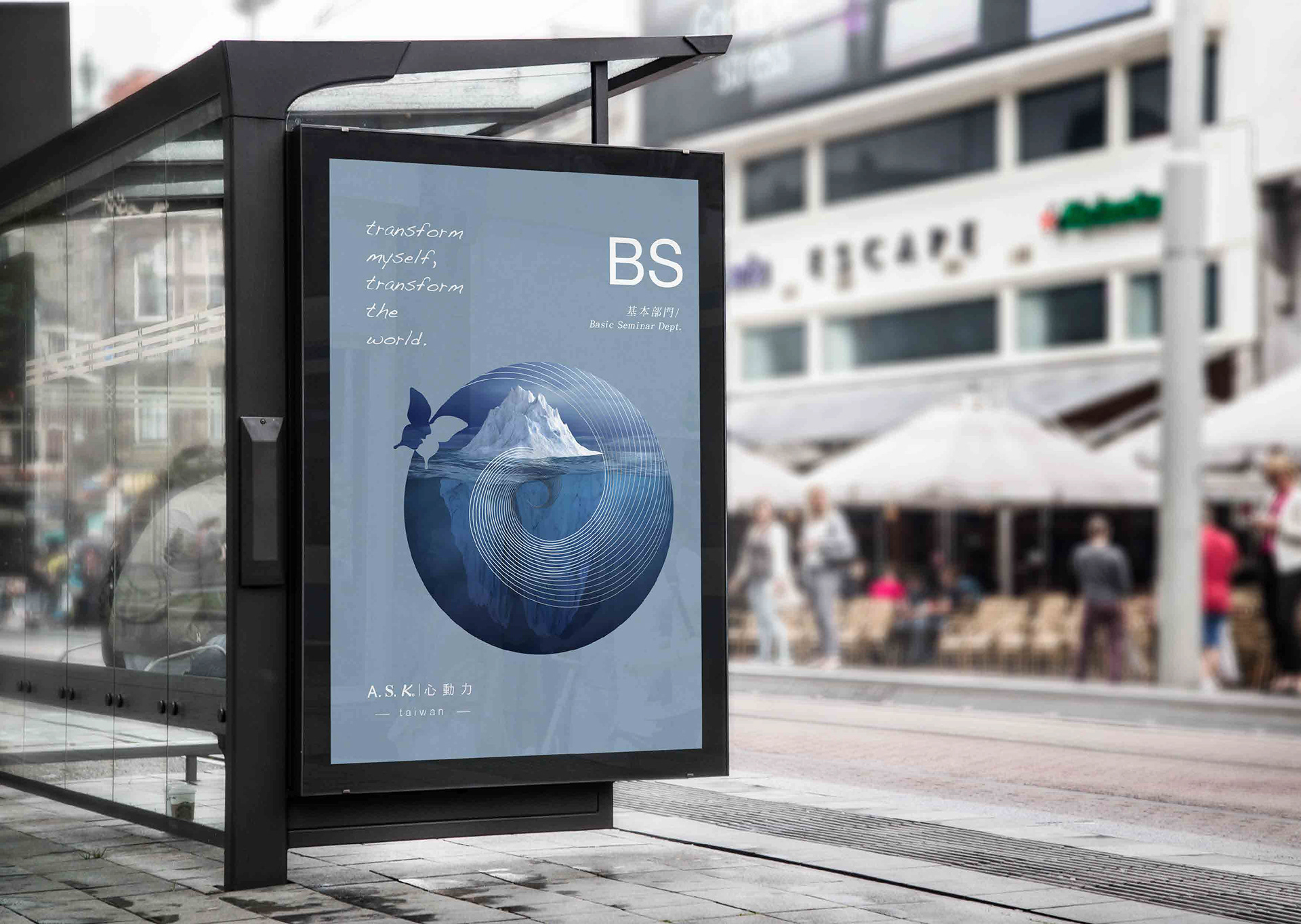
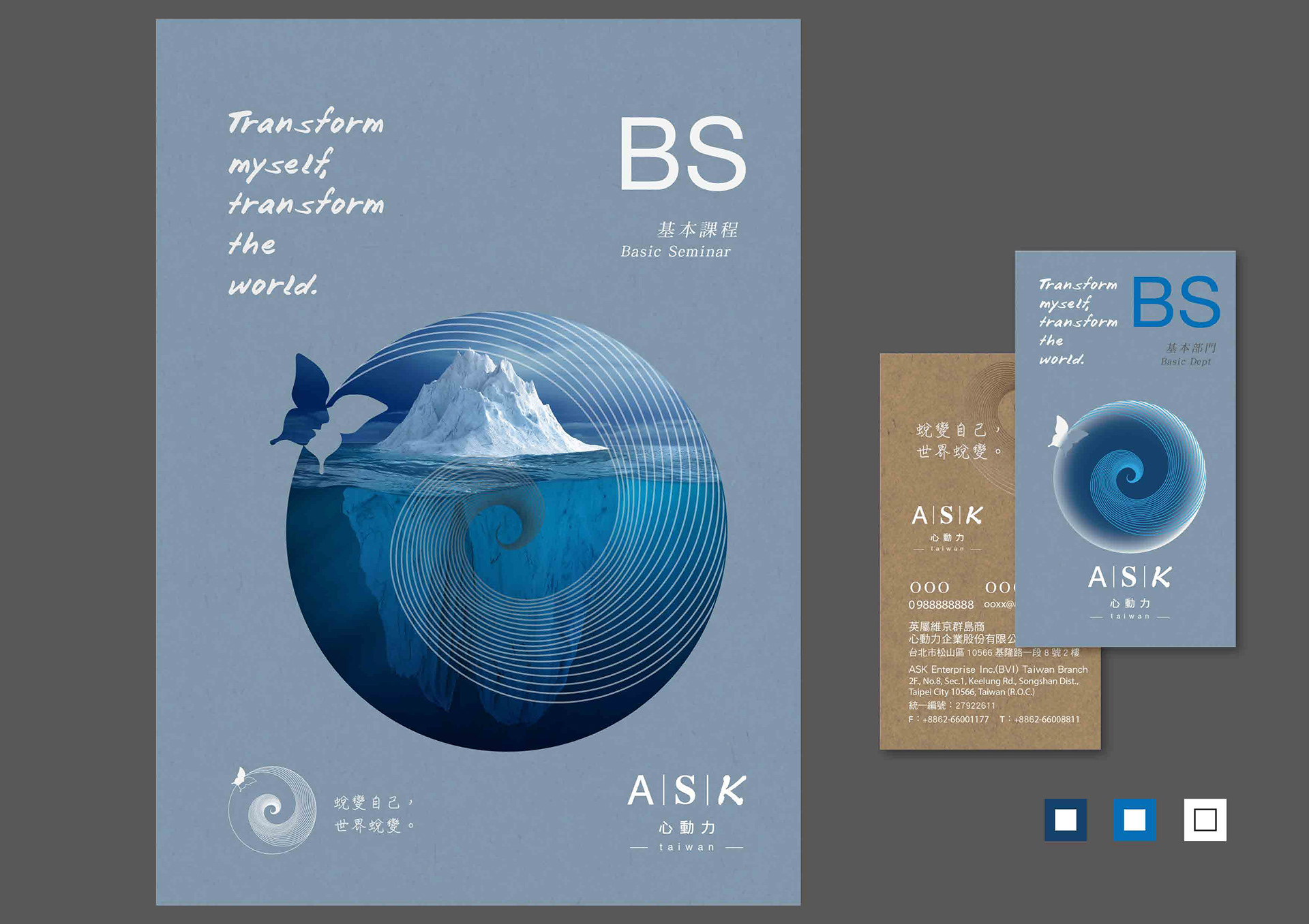
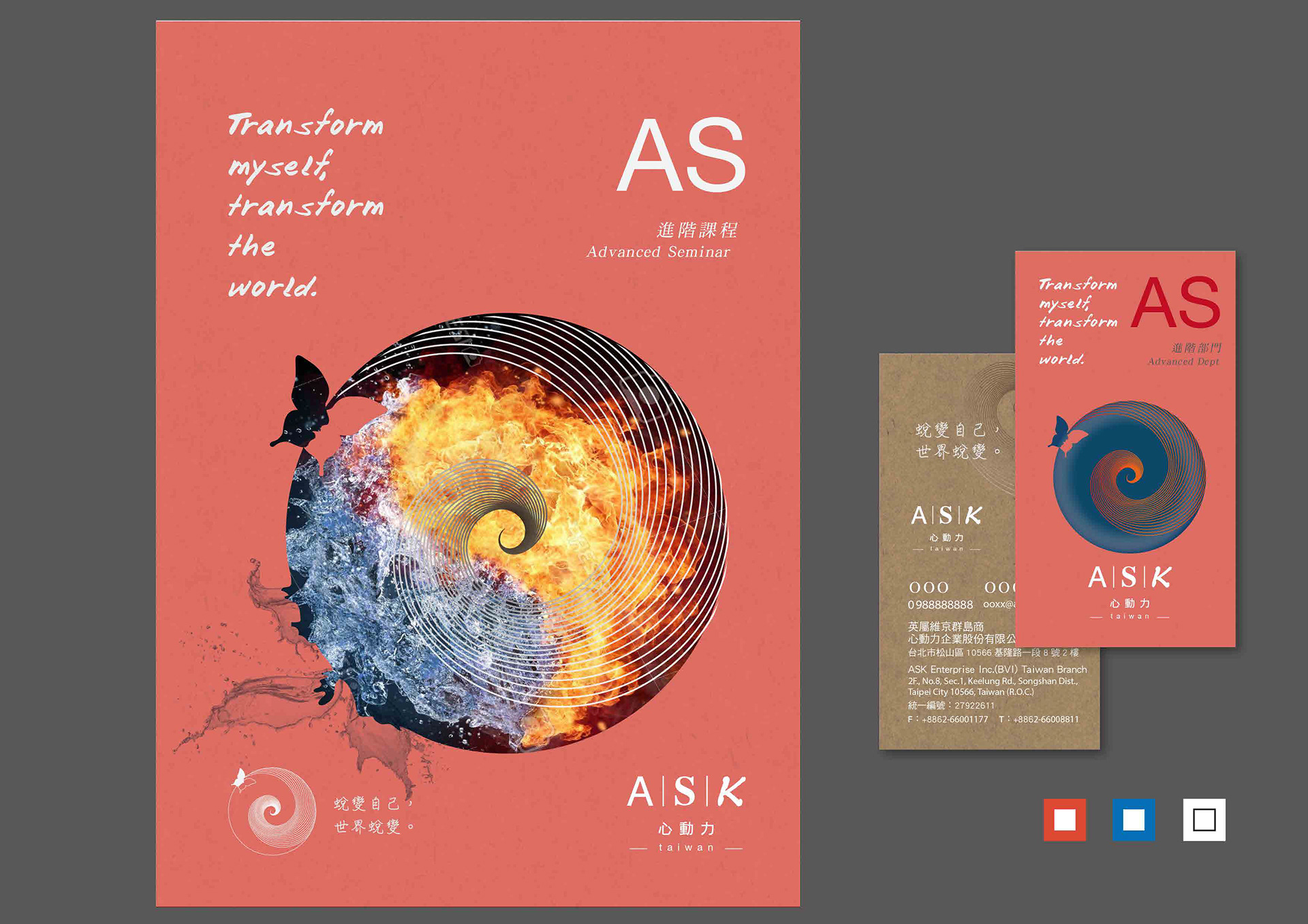
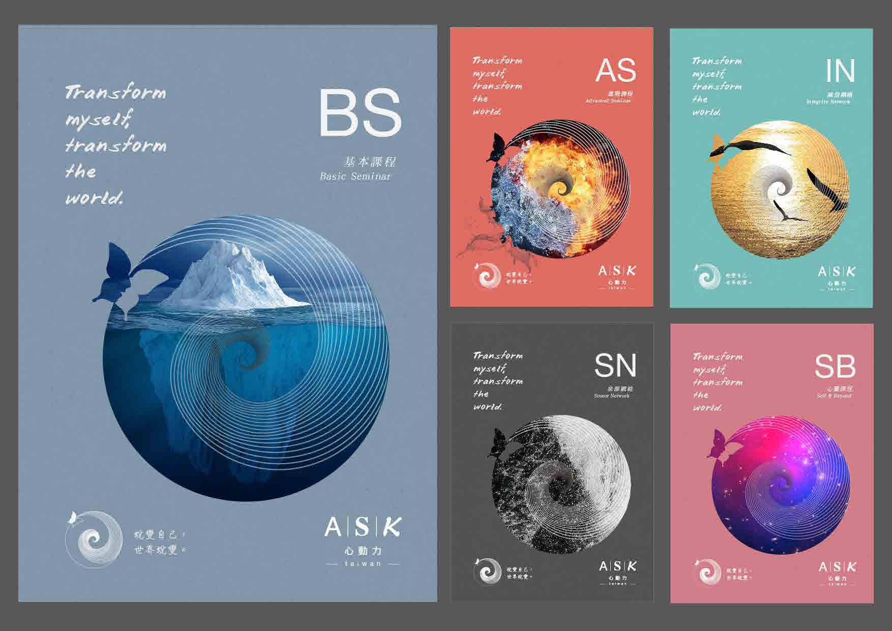
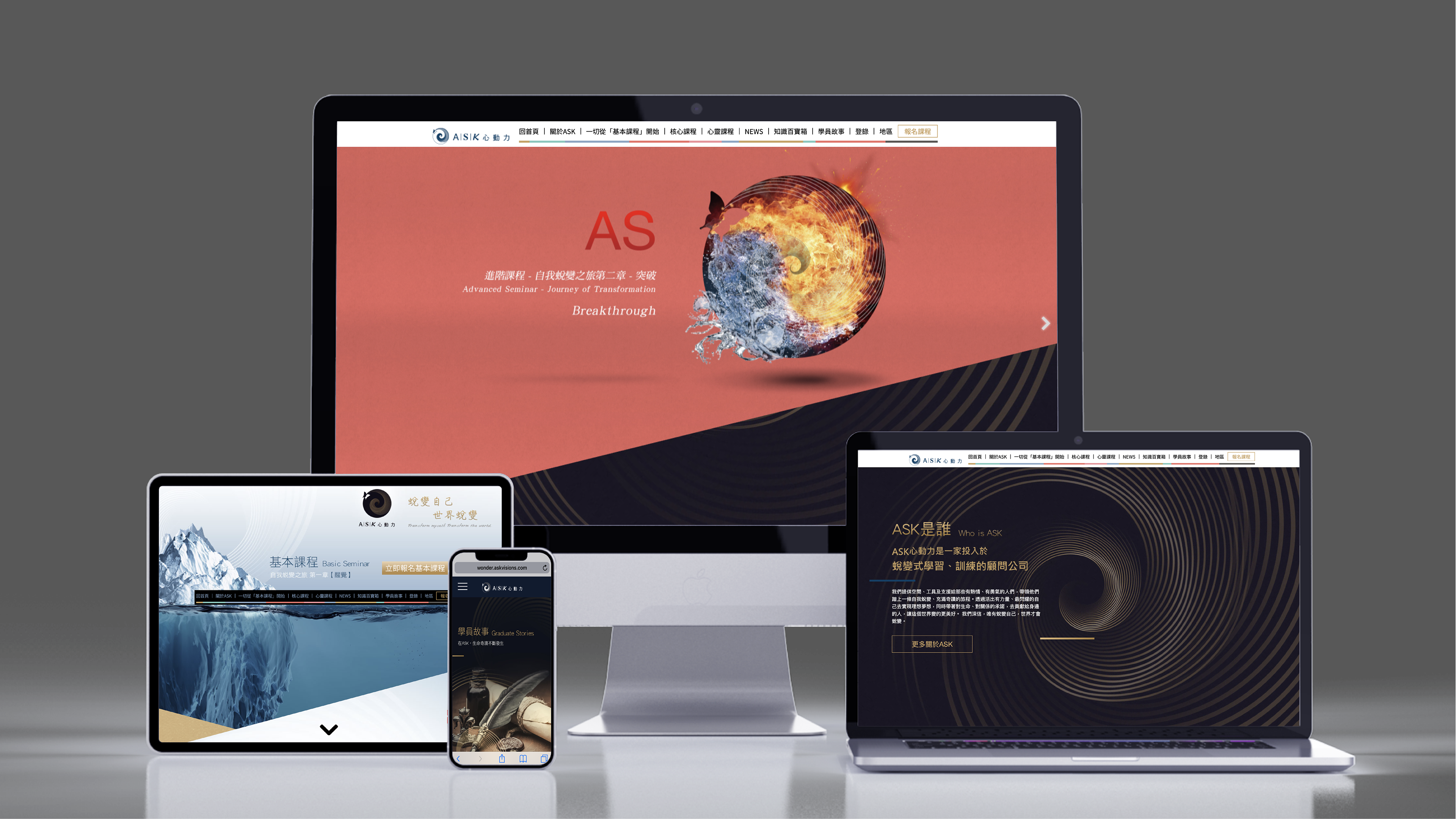
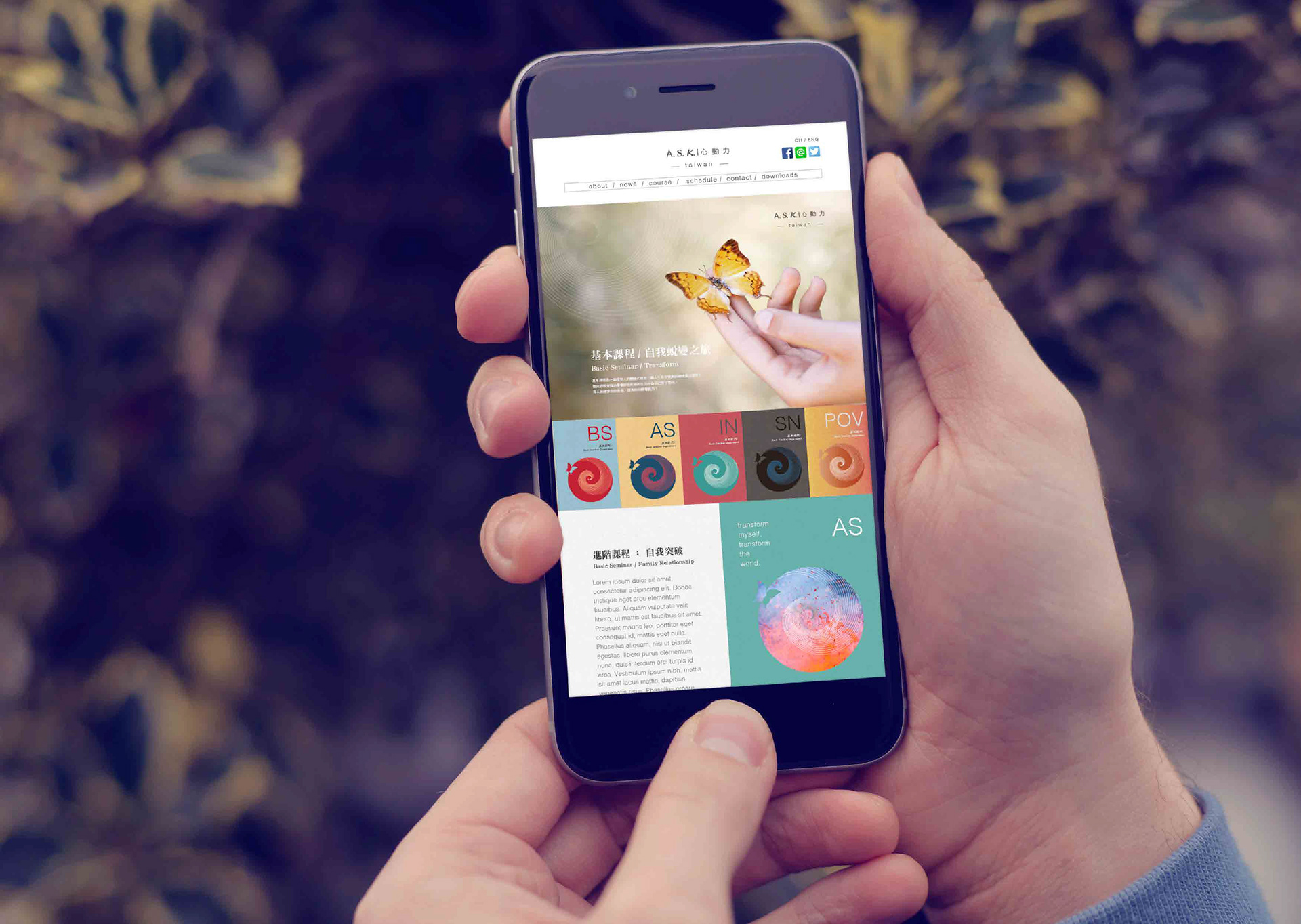
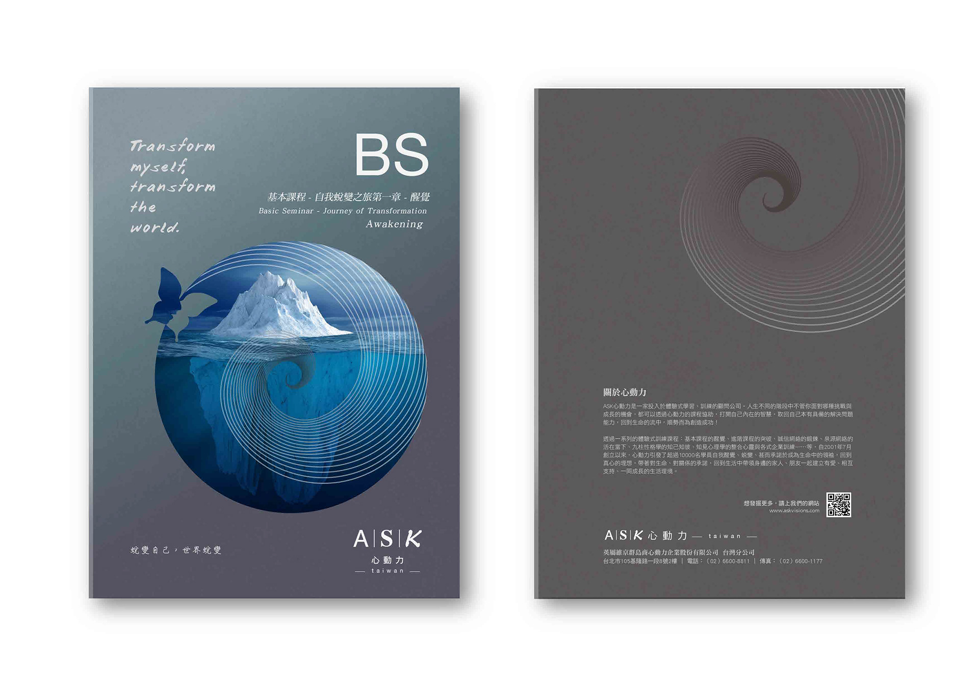
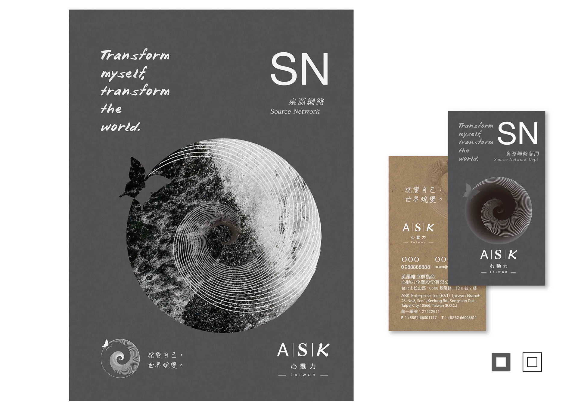
每個部門有不同範疇的個性與代表的色系,在不協調的配色中找到彼此的平衡。搭配冰山、水火、宇宙、潮汐等大自然的畫面,加深人與大自然的連結,在這時候再次結合。
The different divisions within has different traits and symbolic colors to represent themselves. There's a unique balance in the conflicting combination of colors. Natural images such as iceberg, water, fire, tides, universe were used to pair up with the concept of the connection between people and nature.
ASK心動力|識別系統
2022
CHIHE BRANDING CONSULTANCY
MORE